

Jacaranda Purple
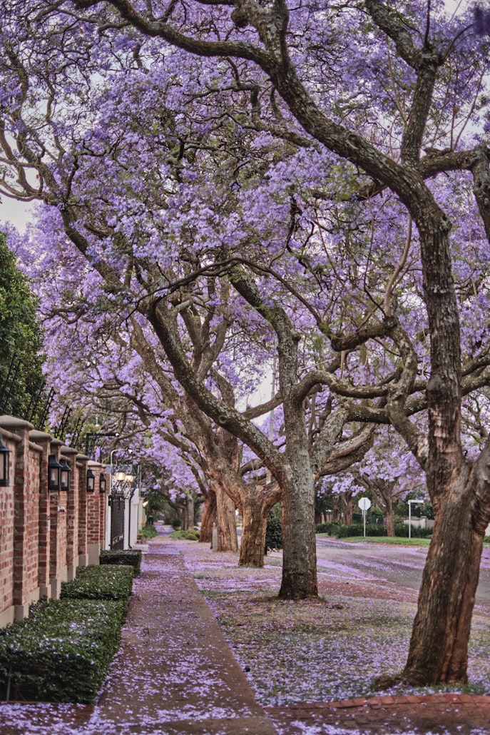
Photo (via Unsplash) courtesy of the author
The COLOR CODEX series — to which SEMIOVOX has invited 50 of our commercial / applied semiotician colleagues from around the world to contribute — explores the unexpected associations evoked for each of us by specific colors found in the material world. Vol. 1: 2023–24. Vol. 2: 2026–27.
I first encountered jacaranda purple while living in Johannesburg a few years ago. For a brief period in late October, the city fills with an intense and vibrant violet-blue color that spreads across canopies, pavements, and even the air itself. Jacaranda trees burst into bloom, creating a scene that feels at once both serene and cinematographic, as if a filter had been applied to reality.
Coming from Paris, and having never lived in the southern hemisphere before, this color immediately signified “elsewhere” for me. I had never seen such an intensity, such a vibrancy in a natural color. Its ephemerality also became inseparable, in my memory, from the experience of discovering a new country, a new continent, and a new temporal rhythm.
Unlike most culturally codified purples, historically associated with rarity, mystery, and an almost sacred dimension, jacaranda purple is defined by overabundance. The flowers are everywhere, covering streets, sticking to shoes, clogging gutters, filling entire avenues. The colour is not curated; it is naturally dispersed. It’s both wild and strangely unreal. Purple is relatively rare in nature — yet here it takes over completely, replacing green foliage with an almost artificial intensity. In this sense, jacaranda purple inverts the traditional semiotics of purple. What is usually a marker of distinction becomes ambient noise.
Yet it carries a strong emotional charge. Purple is often linked to spirituality, to introspection, depth, and distance from the material world. Jacaranda purple, by contrast, expresses something extroverted. It is the color of expansion and collective energy. Its arrival coincides with the beginning of summer in South Africa: Terraces fill up, people gather outdoors and the city becomes more social and more open. The blossoms seem to amplify this shift. They are photographed, pointed out, shared. The color suggests a form of joyful spirituality: grounded, immediate, and lived rather than contemplative.
The color is also tightly bound to temporality. Its appearance is abrupt. The city does not transition gradually into jacaranda purple, it switches overnight. This gives the color a specific temporal function: It marks a real threshold, a passage. It signals that something has already begun to pass. Almost as quickly as it began, it starts to disappear: The fallen flowers darken, decay, and are swept away. The color contains its own ending.
Jacaranda purple is not a stable hue that can be isolated or reproduced. It is a phenomenon dependent on scale, season, and transformation. It marks the beginning of summer but also the awareness that this moment is already passing.
For me, it will always remain the color of arrival, of ephemeral joyful moments, and of everything that can’t be held.
COLOR CODEX: Martha Arango (Sweden) on FALUKORV RED | Rachel Lawes (England) on DEVIL GREEN | Audrey Bartis (France) on KYOTO MOSS | Maciej Biedziński (Poland) on SKIN-DEEP ORANGE | Natasha Delliston (England) on MARRAKECH MINT | Whitney Dunlap-Fowler (USA) on RESURRECTION CANARY BLUE | Ximena Tobi (Argentina) on VILLA MISERIA BRICK | Aiyana Gunjan (India) on LETTERBOX RED | Lucia Laurent-Neva (England) on TEAL BLUE VOYAGER | Charles Leech (Canada) on STORMTROOPER WHITE | William Liu (China) on PINING GREEN | Ramona Lyons (USA) on GOTH PURPLE | Greg Rowland (England) on LAUNDROMAT FUTURA | Sónia Marques (Portugal) on RUNAWAY BURRO | Max Matus (Mexico) on CALIFORNIAN BLUE | Chirag Mediratta (Canada / India) on AUROVILLE ORANGE | Alfredo Troncoso (Mexico) on BORGES GLAUQUE | Josh Glenn (USA) on TOLKIEN GREEN | Clio Meurer (Brazil) on PARIS LUMINOUS GREY | Serdar Paktin (Turkey / England) on AMBIENT AMBER | Maria Papanthymou (Russia / Greece) on AGALMATOLITE WHITE | Sarah Johnson (Canada) on ARMY GREEN | Vijay Parthasarathy (USA) on ALPHONSO YELLOW | Tim Spencer (England) on ELECTRO-EROTIC COBALT | Adelina Vaca (Mexico) on MEXICAN PINK | Brian Khumalo (South Africa / USA) on STATUE OF LIBERTY TEAL | Madoka Suganuma (Japan) on BLOSSOM PINK | Susan Bell (Australia) on THAILAND TURQUOISE | Rajan Luthra (India) on AMALTAS YELLOW | Carla Moss (Austria) on EASTERN BLOC GREY | Dora Jurd de Girancourt (France) on JACARANDA PURPLE | Alexandra Ncube (England) on PMDD RED | Katrin Horn (Austria) on PIER BLUE | Ľudmila Lackova Bennett (Czech Republic) on BARBIE PINK | Onaiza Drabu (India) on MOHARRAM BLACK | Jiakun Wang (China) on GEN Z PURPLE | Manar R. El Wahsh (Canada) on FATIMID GOLD | Gianlluca Simi (Brazil) on TECH BLUE | Gemma Jones (Netherlands) on IN-BETWEEN INDIGO | Mariane Cara (Brazil) on IPANEMA GOLDGLOW | Su Luo (China) on CHILLI OIL RED | Jamin Pelkey (Canada) on KELLS CORAL | Cathy Maisano (Australia) on AUSTRALIAN SUNSET | Hyaesook Yang (South Korea) on TBD | TBD on TBD | Eugene Gorny (Thailand) on FLAMBOYANT RED | Elinor Lifshitz (Switzerland) on BAMBOO GREEN | Nimesh Nambiar (UAE) on DUBAI DUNES | Iván Islas (Mexico) on MITLA YELLOW | Victoria Gerstman (Scotland) on CALPOL PURPLE.
Also see these global semio series: MAKING SENSE (Q&As) | SEMIOFEST SESSIONS (monthly mini-conferences) | COVID CODES | SEMIO OBJECTS | COLOR CODEX | DECODER (fictional semioticians) | CASE FILE | PHOTO OP | MEDIA DIET | TATTOO YOU (semioticians’ tattoos).