

Elle in Blue
The COLOR CODEX series — to which SEMIOVOX has invited 50 of our commercial / applied semiotician colleagues from around the world to contribute — explores the unexpected associations evoked for each of us by specific colors found in the material world. Vol. 1: 2023–24. Vol. 2: 2026–27.
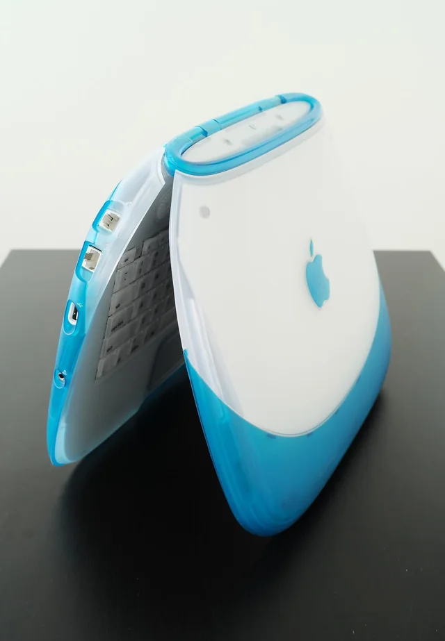
When I was a child, Apple products were not even sold in Brazil. If you were not used to travelling abroad then, all you had were images of their coveted products on TV and on the incipient ‘online world’. In my case, there was also a technology magazine callede Info. My dad subscribed to it and I would spend hours building my future set-up with the gadgets I saw in its pages. In one issue, I discovered a beautiful vision of the future: a blue iBook G3.
What a beauty!
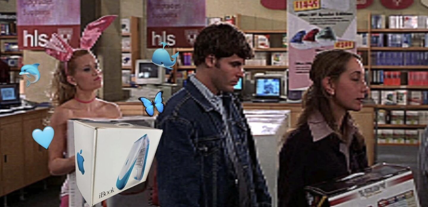
I’d been obsessed with the colourful iBooks since an inciting incident in Legally Blonde, when Elle Woods runs to a shop to get herself an orange iBook whilst dressed as a bunny, after she was humiliated by her Harvard Law School peers. Her orange iBook was the symbol of her new, stronger, more mature self. For me, it was the blue one — so I ripped out the page with the blue iBook from that magazine and plastered it on my bedroom wall: a mood board for my future self!
Since then, we have seen some colour return after a couple of decades under the tyranny of beige and grey. Unsurprisingly, Apple themselves have been leading some of that: colour iMacs, orange iPhones, bright watch faces, maximalist HomePods, and now the MacBook Neo. However, back then, we had something slightly different: the colours were brighter (never muted or pastel) and the products most certainly were not shown in any minimalist settings.
I recently learnt that this bygone aesthetic has a name: Frutiger Aero. ‘Frutiger’ from the typeface and ‘Aero’ from the glassy Windows design language. And blue — like the iBook I so desperately wished for — seems to synthesise that aesthetic, dominated by this nearly transparent hue that stood in for the sheer optimism we felt during the early rise of the internet. The sky, the ocean, and the Earth itself are traditionally portrayed in blue, which thus became the colour of infinity, of the vast, boundless horizon towards which we headed each time we’d start typing a website’s ‘www’.
Not only would that optimism about the future turn sour ,but that aesthetic has come to be frowned upon: tacky, tasteless, lowbrow. Minimalism took over. All brands became a doppelgänger of the same Helvetica-like, black-and-white logo, and Frutiger Aero fell into oblivion — until Gen Z brought it back, starting with TikTok and Instagram. The lackadaisical, whimsical, and nonchalant style of Comic Sans-adjacent typefaces and images of butterflies laid over a monitor surrounded by bubbles made a comeback.
We don’t have the optimism back — not yet. But not matter how cynical Millennials and Gen Zers might have become, part of me still hopes we’ll get some of that blue Frutiger Aero enthusiasm back. Where nothing else might give hope, a blue iBook would at least give me a bit of a push towards my Elle Woods era. It’s about time!
COLOR CODEX: Martha Arango (Sweden) on FALUKORV RED | Rachel Lawes (England) on DEVIL GREEN | Audrey Bartis (France) on KYOTO MOSS | Maciej Biedziński (Poland) on SKIN-DEEP ORANGE | Natasha Delliston (England) on MARRAKECH MINT | Whitney Dunlap-Fowler (USA) on RESURRECTION CANARY BLUE | Ximena Tobi (Argentina) on VILLA MISERIA BRICK | Aiyana Gunjan (India) on LETTERBOX RED | Lucia Laurent-Neva (England) on TEAL BLUE VOYAGER | Charles Leech (Canada) on STORMTROOPER WHITE | William Liu (China) on PINING GREEN | Ramona Lyons (USA) on GOTH PURPLE | Greg Rowland (England) on LAUNDROMAT FUTURA | Sónia Marques (Portugal) on RUNAWAY BURRO | Max Matus (Mexico) on CALIFORNIAN BLUE | Chirag Mediratta (Canada / India) on AUROVILLE ORANGE | Alfredo Troncoso (Mexico) on BORGES GLAUQUE | Josh Glenn (USA) on TOLKIEN GREEN | Clio Meurer (Brazil) on PARIS LUMINOUS GREY | Serdar Paktin (Turkey / England) on AMBIENT AMBER | Maria Papanthymou (Russia / Greece) on AGALMATOLITE WHITE | Sarah Johnson (Canada) on ARMY GREEN | Vijay Parthasarathy (USA) on ALPHONSO YELLOW | Tim Spencer (England) on ELECTRO-EROTIC COBALT | Adelina Vaca (Mexico) on MEXICAN PINK | Brian Khumalo (South Africa / USA) on STATUE OF LIBERTY TEAL | Madoka Suganuma (Japan) on BLOSSOM PINK | Susan Bell (Australia) on THAILAND TURQUOISE | Rajan Luthra (India) on AMALTAS YELLOW | Carla Moss (Austria) on EASTERN BLOC GREY | Dora Jurd de Girancourt (France) on JACARANDA PURPLE | Alexandra Ncube (England) on PMDD RED | Katrin Horn (Austria) on PIER BLUE | Ľudmila Lackova Bennett (Czech Republic) on BARBIE PINK | Onaiza Drabu (India) on MOHARRAM BLACK | Jamin Pelkey (Canada) on KELLS CORAL | Manar R. El Wahsh (Canada) on FATIMID GOLD | Gianlluca Simi (Brazil) on ELLE IN BLUE | Jiakun Wang (China) on GEN Z PURPLE | Mariane Cara (Brazil) on IPANEMA GOLDGLOW | Eugene Gorny (Thailand) on FLAMBOYANT RED | Gemma Jones (Netherlands) on IN-BETWEEN INDIGO | Cathy Maisano (Australia) on AUSTRALIAN SUNSET | Victoria Gerstman (Scotland) on CALPOL PURPLE | Iván Islas (Mexico) on MITLA YELLOW | Su Luo (China) on CHILLI OIL RED | Nimesh Nambiar (UAE) on DUBAI DUNES | Hyaesook Yang (South Korea) on THE INTERSTICE GRADIENT | Alice Sweitzer (Germany) on HÖR GREEN | Elinor Lifshitz (Switzerland) on BAMBOO GREEN.
Also see these global semio series: MAKING SENSE (Q&As) | SEMIOFEST SESSIONS (monthly mini-conferences) | COVID CODES | SEMIO OBJECTS | COLOR CODEX | DECODER (fictional semioticians) | CASE FILE | PHOTO OP | MEDIA DIET | TATTOO YOU (semioticians’ tattoos).