

Ipanema Goldglow
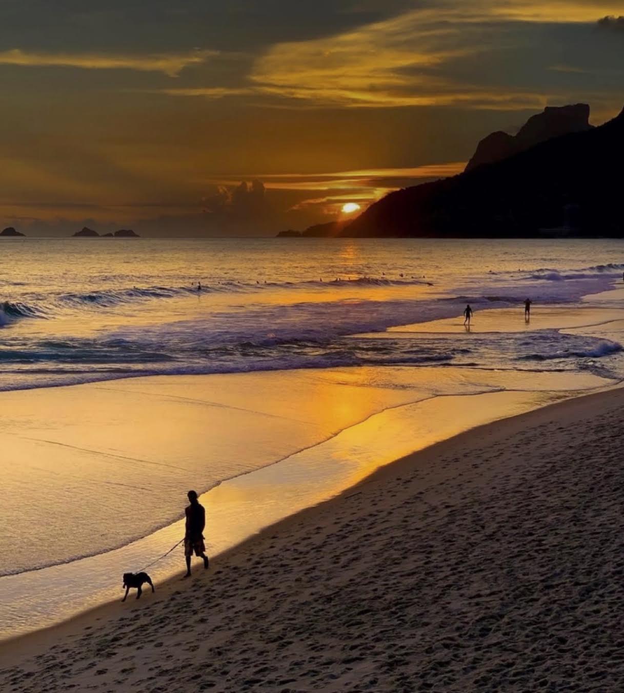
Photo courtesy of the author. Photo credit: Leandro Lemos.
The COLOR CODEX series — to which SEMIOVOX has invited 50 of our commercial / applied semiotician colleagues from around the world to contribute — explores the unexpected associations evoked for each of us by specific colors found in the material world. Vol. 1: 2023–24. Vol. 2: 2026–27.
I grew up among the harsh silvers of São Paulo. The tones of concrete, viaducts, rain-soaked asphalt, weathered façades and buildings dissolving into fractured horizons, where one structure seems to rise endlessly upon another. A city where the sun is often hidden behind construction, shaped by towering verticality and architectural permanence.
Maybe that’s why I became fascinated by curves, organic forms and elusive colors.
Every time I go to Rio, the same striking and beautiful opposition awaits me: the golden glow of Ipanema. This color embodies the perfect tension between the urban palette that shaped my gaze and a luminous landscape that seems to reinvent golden light itself.
At first, it appears to be the color of sunset. But sunsets belong to many places. What makes Ipanema extraordinary is the way it receives and transforms light. The curves traced by delicate waves, the majestic presence of its mountains, the shadows impressed upon the sand and the shimmering reflections across the water all contribute to a gold that feels inseparable from the landscape itself.
Less a Pantone color than an entire atmosphere, what we might call “Ipanema Goldglow” is impossible to contain within a commercial shade. As a semiotician interested in meanings that emerge before language can fully organize them, I have long understood that some signs exist somewhere between perception and memory. Ipanema Goldglow is one of those signs: It reveals itself only briefly before vanishing again. Its very ephemerality demands the eye and the sensitivity of attentive photographers to rescue that fleeting moment from disappearance.
That is exactly what I found in this photograph (used with permission) by street photographer Leandro Lemos. Here, the color is neither entirely sea nor sky. Neither shadow nor radiance. It hovers somewhere in between: a fleeting convergence of forms, depths, reflections and light that might otherwise go unnoticed. It emerges from a rare encounter between geography and light, creating a golden brilliance that feels uniquely its own.
The paradox of Ipanema Goldglow is that it endures precisely because it does not endure. It passes before our eyes between 5:00 and 5:45 p.m., only to disappear completely. Yet those fleeting moments seem capable of generating an entire imaginary of their own. Perhaps this is why Rio has inspired so many songs, photographs, poems and dreams. Its beauty is not merely observed… it is continually recreated in the imagination.
Especially for someone, like me, who is deeply accustomed to the restrained industrial grays of another place.
COLOR CODEX: Martha Arango (Sweden) on FALUKORV RED | Rachel Lawes (England) on DEVIL GREEN | Audrey Bartis (France) on KYOTO MOSS | Maciej Biedziński (Poland) on SKIN-DEEP ORANGE | Natasha Delliston (England) on MARRAKECH MINT | Whitney Dunlap-Fowler (USA) on RESURRECTION CANARY BLUE | Ximena Tobi (Argentina) on VILLA MISERIA BRICK | Aiyana Gunjan (India) on LETTERBOX RED | Lucia Laurent-Neva (England) on TEAL BLUE VOYAGER | Charles Leech (Canada) on STORMTROOPER WHITE | William Liu (China) on PINING GREEN | Ramona Lyons (USA) on GOTH PURPLE | Greg Rowland (England) on LAUNDROMAT FUTURA | Sónia Marques (Portugal) on RUNAWAY BURRO | Max Matus (Mexico) on CALIFORNIAN BLUE | Chirag Mediratta (Canada / India) on AUROVILLE ORANGE | Alfredo Troncoso (Mexico) on BORGES GLAUQUE | Josh Glenn (USA) on TOLKIEN GREEN | Clio Meurer (Brazil) on PARIS LUMINOUS GREY | Serdar Paktin (Turkey / England) on AMBIENT AMBER | Maria Papanthymou (Russia / Greece) on AGALMATOLITE WHITE | Sarah Johnson (Canada) on ARMY GREEN | Vijay Parthasarathy (USA) on ALPHONSO YELLOW | Tim Spencer (England) on ELECTRO-EROTIC COBALT | Adelina Vaca (Mexico) on MEXICAN PINK | Brian Khumalo (South Africa / USA) on STATUE OF LIBERTY TEAL | Madoka Suganuma (Japan) on BLOSSOM PINK | Susan Bell (Australia) on THAILAND TURQUOISE | Rajan Luthra (India) on AMALTAS YELLOW | Carla Moss (Austria) on EASTERN BLOC GREY | Dora Jurd de Girancourt (France) on JACARANDA PURPLE | Alexandra Ncube (England) on PMDD RED | Katrin Horn (Austria) on PIER BLUE | Ľudmila Lackova Bennett (Czech Republic) on BARBIE PINK | Onaiza Drabu (India) on MOHARRAM BLACK | Jamin Pelkey (Canada) on KELLS CORAL | Manar R. El Wahsh (Canada) on FATIMID GOLD | Gianlluca Simi (Brazil) on ELLE IN BLUE | Jiakun Wang (China) on GEN Z PURPLE | Mariane Cara (Brazil) on IPANEMA GOLDGLOW | Eugene Gorny (Thailand) on FLAMBOYANT RED | Gemma Jones (Netherlands) on IN-BETWEEN INDIGO | Cathy Maisano (Australia) on AUSTRALIAN SUNSET | Victoria Gerstman (Scotland) on CALPOL PURPLE | Iván Islas (Mexico) on MITLA YELLOW | Su Luo (China) on CHILLI OIL RED | Nimesh Nambiar (UAE) on DUBAI DUNES | Hyaesook Yang (South Korea) on THE INTERSTICE GRADIENT | Alice Sweitzer (Germany) on HÖR GREEN | Elinor Lifshitz (Switzerland) on BAMBOO GREEN.
Also see these global semio series: MAKING SENSE (Q&As) | SEMIOFEST SESSIONS (monthly mini-conferences) | COVID CODES | SEMIO OBJECTS | COLOR CODEX | DECODER (fictional semioticians) | CASE FILE | PHOTO OP | MEDIA DIET | TATTOO YOU (semioticians’ tattoos).