

Eastern Bloc Grey
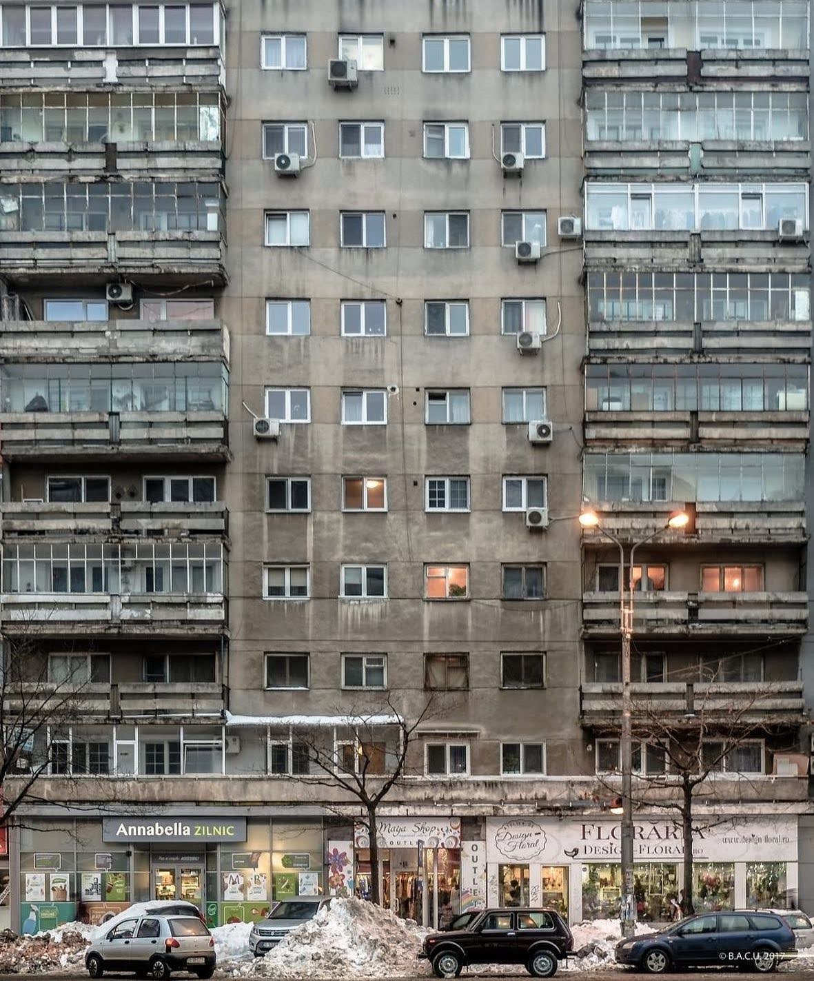
Photo courtesy of the author
The COLOR CODEX series — to which SEMIOVOX has invited 50 of our commercial / applied semiotician colleagues from around the world to contribute — explores the unexpected associations evoked for each of us by specific colors found in the material world. Vol. 1: 2023–24. Vol. 2: 2026–27.
The month of May had me travelling more than usual — coincidentally, to areas of the former Eastern Bloc: Brno in Czech Republic, Warsaw in Poland, Bucharest, Romania. From trains and taxis I could see cities and suburbs pass me by, only to recognize a feeling of intense familiarity accompanying me along the way: the bland yet somehow, through repetition, calming grey of the communist apartment blocks.
I come from Romania myself. Born in a small town in Transylvania and having spent my student years in Bucharest, the grey apartment blocks have been my home for more than 20 years. Walking amongst these buildings, the repetition is almost labyrinthical: one needs to look up numbers or other signals of distinctiveness in order to find an address. Being between two apartment buildings you could be anywhere: in a random Bucharest neighborhood, a small, but heavily industrialized Russian town, in Bulgaria, Ukraine or Slovakia.
These low-cost, concrete-panelled apartment blocks — a deliberately scalable model — are synonymous with the rapid industrialization of the Eastern Bloc and the sameness that communist ideology demanded.
The colour performs differently depending on scale and proximity. A sea of grey that from afar looks symmetrical, almost calming while from close up feels claustrophobic, overheated in summer, a colour that has you drowning in sameness. A sameness that could be easily interpreted as uniformity, collectivism, the erasure of individual expression.
One of my favorite Romanian film directors, Cristi Puiu, uses this feeling of entrapment when showing a tense family reunion in the movie Sieranevada. The name carries those of famous mountains, but the reference here is the tall, Soviet buildings that from afar, could read as foggy mountains against a field.
Today, rehabilitation projects that intentionally add colour in the renovation process, as well as street art and loud ads, disrupt the dullness of the grey, and add aesthetic noise to the urban noise, making the chaos of these often disorganised conglomerates complete.
As for myself — now in a high-ceilinged Viennese Altbau — I find I still carry a fondness for that grey. Not enough to return to it. Just enough to recognise it as mine.
COLOR CODEX: Martha Arango (Sweden) on FALUKORV RED | Rachel Lawes (England) on DEVIL GREEN | Audrey Bartis (France) on KYOTO MOSS | Maciej Biedziński (Poland) on SKIN-DEEP ORANGE | Natasha Delliston (England) on MARRAKECH MINT | Whitney Dunlap-Fowler (USA) on RESURRECTION CANARY BLUE | Ximena Tobi (Argentina) on VILLA MISERIA BRICK | Aiyana Gunjan (India) on LETTERBOX RED | Lucia Laurent-Neva (England) on TEAL BLUE VOYAGER | Charles Leech (Canada) on STORMTROOPER WHITE | William Liu (China) on PINING GREEN | Ramona Lyons (USA) on GOTH PURPLE | Greg Rowland (England) on LAUNDROMAT FUTURA | Sónia Marques (Portugal) on RUNAWAY BURRO | Max Matus (Mexico) on CALIFORNIAN BLUE | Chirag Mediratta (Canada / India) on AUROVILLE ORANGE | Alfredo Troncoso (Mexico) on BORGES GLAUQUE | Josh Glenn (USA) on TOLKIEN GREEN | Clio Meurer (Brazil) on PARIS LUMINOUS GREY | Serdar Paktin (Turkey / England) on AMBIENT AMBER | Maria Papanthymou (Russia / Greece) on AGALMATOLITE WHITE | Sarah Johnson (Canada) on ARMY GREEN | Vijay Parthasarathy (USA) on ALPHONSO YELLOW | Tim Spencer (England) on ELECTRO-EROTIC COBALT | Adelina Vaca (Mexico) on MEXICAN PINK | Brian Khumalo (South Africa / USA) on STATUE OF LIBERTY TEAL | Madoka Suganuma (Japan) on BLOSSOM PINK | Susan Bell (Australia) on THAILAND TURQUOISE | Rajan Luthra (India) on AMALTAS YELLOW | Carla Moss (Austria) on EASTERN BLOC GREY | Dora Jurd de Girancourt (France) on JACARANDA PURPLE | Alexandra Ncube (England) on PMDD RED | Katrin Horn (Austria) on PIER BLUE | Ľudmila Lackova Bennett (Czech Republic) on BARBIE PINK | Onaiza Drabu (India) on MOHARRAM BLACK | Jamin Pelkey (Canada) on KELLS CORAL | Manar R. El Wahsh (Canada) on FATIMID GOLD | Gianlluca Simi (Brazil) on ELLE IN BLUE | Jiakun Wang (China) on GEN Z PURPLE | Mariane Cara (Brazil) on IPANEMA GOLDGLOW | Eugene Gorny (Thailand) on FLAMBOYANT RED | Gemma Jones (Netherlands) on IN-BETWEEN INDIGO | Cathy Maisano (Australia) on AUSTRALIAN SUNSET | Victoria Gerstman (Scotland) on CALPOL PURPLE | Iván Islas (Mexico) on MITLA YELLOW | Su Luo (China) on CHILLI OIL RED | Nimesh Nambiar (UAE) on DUBAI DUNES | Hyaesook Yang (South Korea) on THE INTERSTICE GRADIENT | Alice Sweitzer (Germany) on HÖR GREEN | Elinor Lifshitz (Switzerland) on BAMBOO GREEN.
Also see these global semio series: MAKING SENSE (Q&As) | SEMIOFEST SESSIONS (monthly mini-conferences) | COVID CODES | SEMIO OBJECTS | COLOR CODEX | DECODER (fictional semioticians) | CASE FILE | PHOTO OP | MEDIA DIET | TATTOO YOU (semioticians’ tattoos).