Teal Blue Voyager
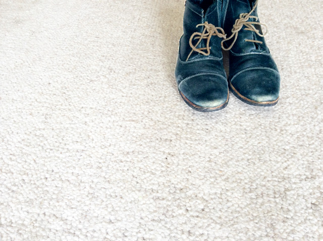
Image courtesy of the author
The COLOR CODEX series — to which SEMIOVOX has invited our semiotician colleagues from around the world to contribute — explores the unexpected associations evoked for each of us by specific colors found in the material world.
Teal Blue Voyager is a beguiling hue that is invigorating and calming at the same time. Even more than that, for me, it is the colour of infinite potential for renewal.
This colour is not turquoise, nor is it simply teal. It doesn’t have the over-enthusiasm of a green teal nor the mysteriousness and sombreness of a dark teal. It is very close to peacock teal. This deep transcendent teal contains more blue than the ubiquitous teal, a dash of black, and a whisker of magenta. It has a lower saturation tonality that makes it inviting and warm. Yet its green and grey undertones provide us with mental energy, confidence, and strength.
I became aware of Teal Blue Voyager about 20 years ago. I frequently travelled by boat to Isla Palma, a natural reserve located in the middle of the ocean, two hours from Cartagena (Colombia). Every time I made the journey, I was mesmerised by the different shades of blue that appeared in the ocean, each creating its own melody. It seemed that the colours were singing through the waves, and my eyes always stopped at the murmuring and hypnotic “sound” of this deep shade of teal blue in the water. Its palpitating nature created a feeling of peace and spiritedness simultaneously, and it emanated a tranquillity that put me at ease while travelling on a bumpy boat. While looking at it, I experienced a sense of expansiveness and even exaltation. It often sent my brain to a place of mixed emotions — from being full of ideas to being profound and introspective, where anything and everything can happen. Since those trips, the Teal Blue Voyager has been an ever-present dream in my life.
I developed an obsession with this colour, to the point of collecting many pieces in this hue — from books and clothes to chairs and ornaments. My favourite example is a pair of boots I wore for almost seven years. What attracted me to them was their colour: introverted, not seeking attention, yet unconventional. I felt unique and creative when I wore them. Those boots opened conversations with friends, pushed my dress sense, and untangled my mind as I walked.
COLOR CODEX: Martha Arango (Sweden) on FALUKORV RED | Rachel Lawes (England) on DEVIL GREEN | Audrey Bartis (France) on KYOTO MOSS | Maciej Biedziński (Poland) on SKIN-DEEP ORANGE | Natasha Delliston (England) on MARRAKECH MINT | Whitney Dunlap-Fowler (USA) on RESURRECTION CANARY BLUE | Ximena Tobi (Argentina) on VILLA MISERIA BRICK | Aiyana Gunjan (India) on LETTERBOX RED | Lucia Laurent-Neva (England) on TEAL BLUE VOYAGER | Charles Leech (Canada) on STORMTROOPER WHITE | William Liu (China) on PINING GREEN | Ramona Lyons (USA) on GOTH PURPLE | Greg Rowland (England) on LAUNDROMAT FUTURA | Sónia Marques (Portugal) on RUNAWAY BURRO | Max Matus (Mexico) on CALIFORNIAN BLUE | Chirag Mediratta (Canada / India) on AUROVILLE ORANGE | Alfredo Troncoso (Mexico) on BORGES GLAUQUE | Josh Glenn (USA) on TOLKIEN GREEN | Clio Meurer (Brazil) on PARIS LUMINOUS GREY | Serdar Paktin (Turkey / England) on AMBIENT AMBER | Maria Papanthymou (Russia / Greece) on AGALMATOLITE WHITE | Sarah Johnson (Canada) on ARMY GREEN | Vijay Parthasarathy (USA) on ALPHONSO YELLOW | Tim Spencer (England) on ELECTRO-EROTIC COBALT | Adelina Vaca (Mexico) on MEXICAN PINK | Brian Khumalo (South Africa / USA) on STATUE OF LIBERTY TEAL | Madoka Suganuma (Japan) on BLOSSOM PINK | Susan Bell (Australia) on THAILAND TURQUOISE | Rajan Luthra (India) on AMALTAS YELLOW | Carla Moss (Austria) on EASTERN BLOC GREY | Dora Jurd de Girancourt (France) on JACARANDA PURPLE | Alexandra Ncube (England) on PMDD RED | Katrin Horn (Austria) on PIER BLUE | Ľudmila Lackova Bennett (Czech Republic) on BARBIE PINK | Onaiza Drabu (India) on MOHARRAM BLACK | Jiakun Wang (China) on GEN Z PURPLE | Manar R. El Wahsh (Canada) on TBD | Gianlluca Simi (Brazil) on TECH BLUE | Gemma Jones (Netherlands) on IN-BETWEEN INDIGO | Mariane Cara (Brazil) on IPANEMA GOLDGLOW | Su Luo (China) on TBD | Jamin Pelkey (Canada) on KELLS CORAL | Cathy Maisano (Australia) on TBD | Hyaesook Yang (South Korea) on TBD | Hibato Ben Ahmed (France) on TBD | Eugene Gorny (Thailand) on BUDDHIST RED | Elinor Lifshitz (Switzerland) on TBD | Jessica Hamel Akré (France) on TBD | Iván Islas (Mexico) on MITLA YELLOW | Victoria Gerstman (Scotland) on TBD.
Also see these global semio series: MAKING SENSE (Q&As) | SEMIOFEST SESSIONS (monthly mini-conferences) | COVID CODES | SEMIO OBJECTS | COLOR CODEX | DECODER (fictional semioticians) | CASE FILE | PHOTO OP | MEDIA DIET | TATTOO YOU (semioticians’ tattoos).