Tolkien Green
From the author's collection
The COLOR CODEX series — to which SEMIOVOX has invited our semiotician colleagues from around the world to contribute — explores the unexpected associations evoked for each of us by specific colors found in the material world.
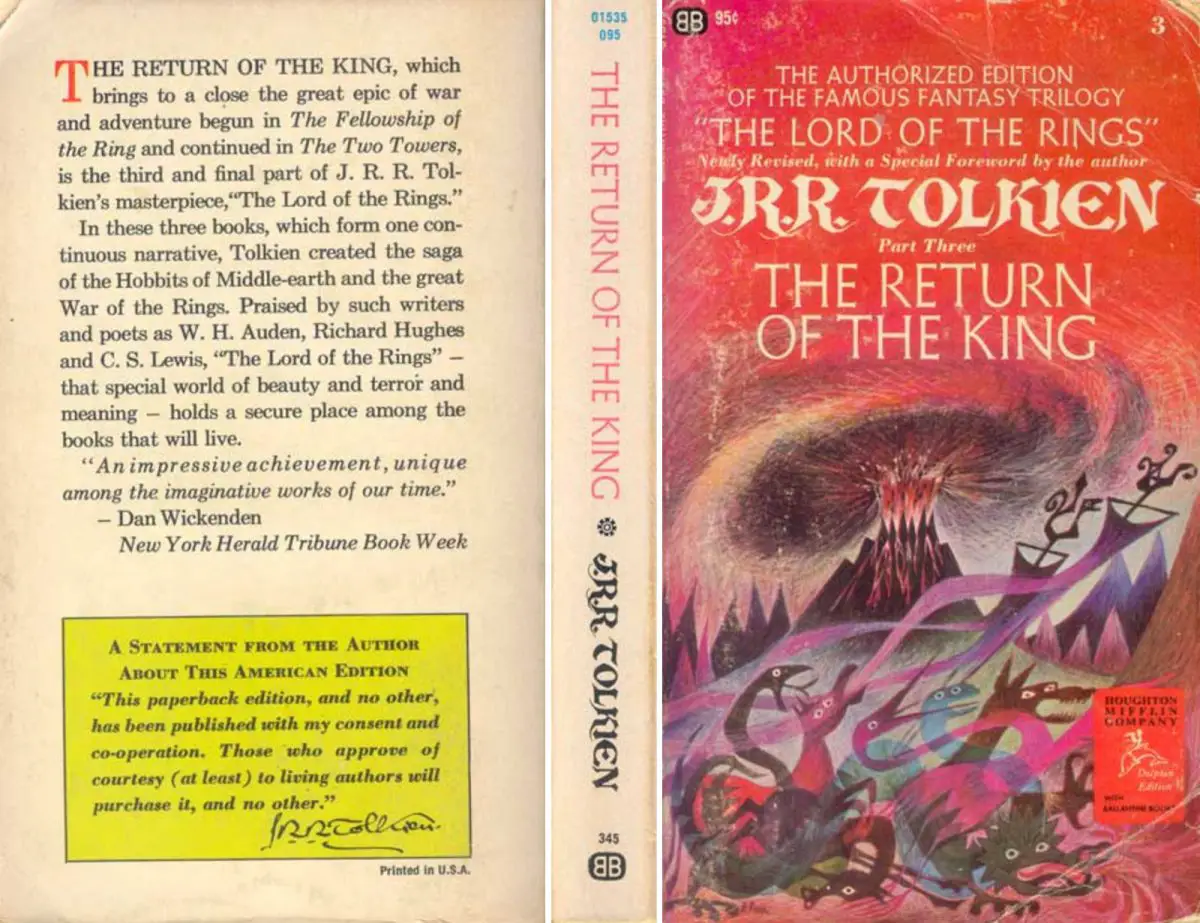
In 1965, Ace Books — a leading purveyor of paperback sci-fi in the United States — attempted to capitalize on a loophole in international copyright law by producing an unauthorized paperback edition of J.R.R. Tolkien’s three-volume Lord of the Rings fantasy epic. (Houghton Mifflin’s hardcover edition had just appeared in the USA, with only modest success.) So Ballantine Books, a rival sci-fi publisher who’d secured an exclusive paperback-edition deal with Houghton Mifflin, was forced to rush their authorized Tolkien series into production that same year. Barbara Remington, the artist tapped to illustrate the series’ covers, wasn’t given enough time to read the books… hence the mythological creatures and African beasts (a lion in the Shire!) that appeared in her artwork.
Despite these hiccups, Ballantine’s Tolkien series enjoyed massive US sales. (A poster based on Remington’s artwork, urging COME TO MIDDLE EARTH, became ubiquitous in college dorm rooms.) Ballantine’s hastily produced series is credited with having created an enduring new market for fantasy novels — paving the way, for example, for reissued editions of Robert E. Howard’s Conan stories. But how did Ballantine’s series triumph over Ace’s? On the back cover of each book in the Tolkien series, the publishers included a statement from the author urging Americans to do the decent thing. Faced with outrage from their own customers, Ace withdrew its bootleg series.
This kerfuffle happened before I was even born. But in the mid–’80s, when I was a nerdy middle-schooler, I stumbled upon a tattered set of Ballantine’s original Lord of the Rings paperbacks while perusing my stepmother’s book collection. I’d only ever seen the post-1973 Ballantine paperbacks — the ones featuring Tolkien’s own far more representative and restrained cover illustrations. I was transfixed! Not merely by Remington’s lurid, far-out artwork, but by Tolkien’s stern statement on the book’s back covers. The statement, any sort of context for the appreciation of which I utterly lacked until recently, was less impressive to me than the author’s runic, Gandalf-ish signature. All of which was framed in a rectangle of a bright greenish yellow, or yellowish green — barberry yellow? golden gun? — let’s call it “Tolkien green.” I’d go on to read and re-read this edition of the series, during my teenage years; gazing solemnly at its front and back covers each time I picked up one of the books.
At some point during the Covid lockdown, I idly picked up one of the Remington-illustrated Lord of the Rings books and glanced at its back cover. That yellow-green rectangle instantly sucked me in, offering to transport me away from my comparatively drab, cloistered everyday life. I felt a physical tug. The Tolkien series, more than any other of the many sci-fi and fantasy books I devoured as an adolescent, had — I didn’t appreciate until that moment of recognition, a moment that inspired me to invite others to contribute their own stories to a “color codex” series — encouraged me to be an imaginative adult. Someone who intuitively believes not only that another world is possible, but that such a world — mysterious, inviting, phantasmagoric — is immediately accessible. If we can just locate a portal. At least I know what color to keep a lookout for.
COLOR CODEX: Martha Arango (Sweden) on FALUKORV RED | Rachel Lawes (England) on DEVIL GREEN | Audrey Bartis (France) on KYOTO MOSS | Maciej Biedziński (Poland) on SKIN-DEEP ORANGE | Natasha Delliston (England) on MARRAKECH MINT | Whitney Dunlap-Fowler (USA) on RESURRECTION CANARY BLUE | Ximena Tobi (Argentina) on VILLA MISERIA BRICK | Aiyana Gunjan (India) on LETTERBOX RED | Lucia Laurent-Neva (England) on TEAL BLUE VOYAGER | Charles Leech (Canada) on STORMTROOPER WHITE | William Liu (China) on PINING GREEN | Ramona Lyons (USA) on GOTH PURPLE | Greg Rowland (England) on LAUNDROMAT FUTURA | Sónia Marques (Portugal) on RUNAWAY BURRO | Max Matus (Mexico) on CALIFORNIAN BLUE | Chirag Mediratta (Canada / India) on AUROVILLE ORANGE | Alfredo Troncoso (Mexico) on BORGES GLAUQUE | Josh Glenn (USA) on TOLKIEN GREEN | Clio Meurer (Brazil) on PARIS LUMINOUS GREY | Serdar Paktin (Turkey / England) on AMBIENT AMBER | Maria Papanthymou (Russia / Greece) on AGALMATOLITE WHITE | Sarah Johnson (Canada) on ARMY GREEN | Vijay Parthasarathy (USA) on ALPHONSO YELLOW | Tim Spencer (England) on ELECTRO-EROTIC COBALT | Adelina Vaca (Mexico) on MEXICAN PINK | Brian Khumalo (South Africa / USA) on STATUE OF LIBERTY TEAL | Madoka Suganuma (Japan) on BLOSSOM PINK | Susan Bell (Australia) on THAILAND TURQUOISE | Rajan Luthra (India) on AMALTAS YELLOW | Carla Moss (Austria) on EASTERN BLOC GREY | Dora Jurd de Girancourt (France) on JACARANDA PURPLE | Alexandra Ncube (England) on PMDD RED | Katrin Horn (Austria) on PIER BLUE | Ľudmila Lackova Bennett (Czech Republic) on BARBIE PINK | Onaiza Drabu (India) on TBD | Jiakun Wang (China) on GEN Z PURPLE | Manar R. El Wahsh (Canada) on TBD | Gianlluca Simi (Brazil) on TECH BLUE | Gemma Jones (Netherlands) on TBD | Mariane Cara (Brazil) on IPANEMA GOLDGLOW | Su Luo (China) on TBD | Jamin Pelkey (Canada) on KELLS CORAL | Cathy Maisano (Australia) on TBD | Hyaesook Yang (South Korea) on TBD | Hibato Ben Ahmed (France) on TBD | Eugene Gorny (Thailand) on BUDDHIST RED | Elinor Lifshitz (Switzerland) on TBD | Jessica Hamel Akré (France) on TBD | Iván Islas (Mexico) on MITLA YELLOW | Victoria Gerstman (Scotland) on TBD.
Also see these global semio series: MAKING SENSE (Q&As) | SEMIOFEST SESSIONS (monthly mini-conferences) | COVID CODES | SEMIO OBJECTS | COLOR CODEX | DECODER (fictional semioticians) | CASE FILE | PHOTO OP | MEDIA DIET | TATTOO YOU (semioticians’ tattoos).