Californian Blue
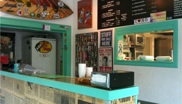
Image courtesy of the author
The COLOR CODEX series — to which SEMIOVOX has invited our semiotician colleagues from around the world to contribute — explores the unexpected associations evoked for each of us by specific colors found in the material world.
Imagery from the Californian coast has spread around the world, thanks to the Hollywood movie industry and mass media communication technologies. Californian beaches, palm trees, and sunshine are some of the potent signs attached to this idyllic landscape; and color-wise, one’s dominant impression is of a vibrant aquamarine hue that we might call… Californian Blue.
Nowadays I live in a little beach town called La Mision, in Baja California Mexico. From my window I can see the beach. Blue is indeed a dominant color here in La Mision, but it’s not the Californian Blue that — due to the many movies and series I’ve watched since I was a child — I’d expected to encounter. Where did the Californian Blue go? Oddly enough, when I finally did encounter this color not long ago, it wasn’t in California but rather in two Mexican restaurants… in Amsterdam.
The world’s image of “California” isn’t just about idyllic visuals but — among other things — Mexican cuisine. Cuisine within the “Cal-Mex” foodscape blends Californian and Mexican methods and ingredients: fresh vegetables grown in California, seafood from the Pacific Ocean. The dishes most representative of Cal-Mex cuisine are fish or shrimp tacos, taco salads, and wraps, all accompanied by prolific use of avocado and sour cream. Traditionally, these meals would be served on California Blue ceramic tableware.
Jeffrey Pilcher, a leading figure in the emerging scholarly field of food history, has noted that Mexican cuisine’s commoditization (that is, the process of converting unique, local, contextualized phenomena into standardized, marketable objects) took off in the 1960s and 1970s, spreading outward from the commoditization’s epicenter in California beach towns. Via what vector did it spread around the United States, and other parts of the world? Pilcher blames surfers: Surfers visiting California followed the example of local surfers in eating “tacos because they were cheap,” he says, “and that really sort of helped to transport them around the world.”
My visit to the first Cal-Mex restaurant established in Amsterdam demonstrates the validity of Pilcher’s argument. Tomas Estes, who died in 2021, opened Café Pacifico in Amsterdam — where Mexican cuisine was unknown — as an expatriate there in 1976. He was one of many Californian countercultural rebels who in the 1960s–70s moved abroad… bringing with them fond memories of tacos, burritos, tostadas, and other signs of the Cal-Mex foodscape. Café Pacifico’s foodscape was the intersemiotic translation of a landscape he both inhabited (California) and experienced as a traveler (Mexico). The restaurant’s second floor, where fishing nets hang from the ceiling, is intended to resemble a bar from a Mexican beach town. The walls are painted Californian Blue.
While in Amsterdam, I also visited The Taco Shop. Kevin, an expat from Colorado, had worked in several Mexican restaurants in California before opening this restaurant in 2018. The Taco Shop’s foodscape reflects a European “translation” of Kevin’s favorite Cal-Mex cuisine; its décor, meanwhile, is intended to resemble a Cal-Mex restaurant from a Californian beach town. Surfboards, rock concert posters, California street signs, and license plates populate the walls; these signs all relate in one way or another to California and its counterculture. And everywhere you look, you spot Californian Blue — a potent symbol of what “California” signifies worldwide.
Californian Blue is the color of: an idyllic place where, as a child, I dreamed of living; a land that I’ve discovered doesn’t actually exist; above all else, a state of mind. To quote Roy Orbison: “Living my life with you on my mind… California Blue!”
COLOR CODEX: Martha Arango (Sweden) on FALUKORV RED | Rachel Lawes (England) on DEVIL GREEN | Audrey Bartis (France) on KYOTO MOSS | Maciej Biedziński (Poland) on SKIN-DEEP ORANGE | Natasha Delliston (England) on MARRAKECH MINT | Whitney Dunlap-Fowler (USA) on RESURRECTION CANARY BLUE | Ximena Tobi (Argentina) on VILLA MISERIA BRICK | Aiyana Gunjan (India) on LETTERBOX RED | Lucia Laurent-Neva (England) on TEAL BLUE VOYAGER | Charles Leech (Canada) on STORMTROOPER WHITE | William Liu (China) on PINING GREEN | Ramona Lyons (USA) on GOTH PURPLE | Greg Rowland (England) on LAUNDROMAT FUTURA | Sónia Marques (Portugal) on RUNAWAY BURRO | Max Matus (Mexico) on CALIFORNIAN BLUE | Chirag Mediratta (Canada / India) on AUROVILLE ORANGE | Alfredo Troncoso (Mexico) on BORGES GLAUQUE | Josh Glenn (USA) on TOLKIEN GREEN | Clio Meurer (Brazil) on PARIS LUMINOUS GREY | Serdar Paktin (Turkey / England) on AMBIENT AMBER | Maria Papanthymou (Russia / Greece) on AGALMATOLITE WHITE | Sarah Johnson (Canada) on ARMY GREEN | Vijay Parthasarathy (USA) on ALPHONSO YELLOW | Tim Spencer (England) on ELECTRO-EROTIC COBALT | Adelina Vaca (Mexico) on MEXICAN PINK | Brian Khumalo (South Africa / USA) on STATUE OF LIBERTY TEAL | Madoka Suganuma (Japan) on BLOSSOM PINK | Susan Bell (Australia) on THAILAND TURQUOISE | Rajan Luthra (India) on AMALTAS YELLOW | Carla Moss (Austria) on EASTERN BLOC GREY | Dora Jurd de Girancourt (France) on JACARANDA PURPLE | Alexandra Ncube (England) on PMDD RED | Katrin Horn (Austria) on PIER BLUE | Ľudmila Lackova Bennett (Czech Republic) on BARBIE PINK | Onaiza Drabu (India) on MOHARRAM BLACK | Jiakun Wang (China) on GEN Z PURPLE | Manar R. El Wahsh (Canada) on TBD | Gianlluca Simi (Brazil) on TECH BLUE | Gemma Jones (Netherlands) on IN-BETWEEN INDIGO | Mariane Cara (Brazil) on IPANEMA GOLDGLOW | Su Luo (China) on TBD | Jamin Pelkey (Canada) on KELLS CORAL | Cathy Maisano (Australia) on TBD | Hyaesook Yang (South Korea) on TBD | Hibato Ben Ahmed (France) on TBD | Eugene Gorny (Thailand) on BUDDHIST RED | Elinor Lifshitz (Switzerland) on TBD | Jessica Hamel Akré (France) on TBD | Iván Islas (Mexico) on MITLA YELLOW | Victoria Gerstman (Scotland) on TBD.
Also see these global semio series: MAKING SENSE (Q&As) | SEMIOFEST SESSIONS (monthly mini-conferences) | COVID CODES | SEMIO OBJECTS | COLOR CODEX | DECODER (fictional semioticians) | CASE FILE | PHOTO OP | MEDIA DIET | TATTOO YOU (semioticians’ tattoos).