Pining Green

Image provided by the author.
The COLOR CODEX series — to which SEMIOVOX has invited our semiotician colleagues from around the world to contribute — explores the unexpected associations evoked for each of us by specific colors found in the material world.
This image shown above represents the history of Chinese passenger trains from the 1950s to the 1990s. Unlike contemporary CRH (Chinese Railway High-Speed) trains, its green livery has a very deep tone, reminiscent of the color of pine trees.
This green evokes many of my childhood travelling memories. Back then, the trains were very slow, and passengers were crowded in the messy cabins. We’d sit or stand together, all longing for the destination to arrive — though with different state of minds. Some of us might have gone through a tough departure from friends and families, but some of us, wishing for a new start, were trying to leave the miserableness behind. Therefore…
- On the one hand, greenness in general can represent a destination or desire for a brighter, better future. In China, green traditionally symboliezes a forward-looking hope, or treasure, or a peaceful life.
- On the other hand, the darkness of Pining Green is sad, yet very connotative and meaningful. It symbolizes desires receding into the distance behind us, the pain of longing and the “pining” emotion.
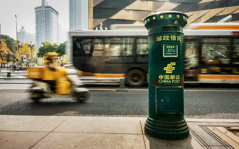
Consider also the dark green identity color of China Post and its representative object, the mailbox. Physical letters, written by hand, convey deep and serious emotions to the receiver — especially in the context of the digital age. Although China Post is very strong in fast and efficient deliveries, this very “slow” regular mail service is still available. Waiting for replies vs. the longing for one’s destination — it’s the same dichotomy.
There you have it: Pining Green, a romantic Chinese color of longing for that which is to come and at the same time for that which we’ve left behind, and which now exists only in our memories. Painful, yet beautiful.
COLOR CODEX: Martha Arango (Sweden) on FALUKORV RED | Rachel Lawes (England) on DEVIL GREEN | Audrey Bartis (France) on KYOTO MOSS | Maciej Biedziński (Poland) on SKIN-DEEP ORANGE | Natasha Delliston (England) on MARRAKECH MINT | Whitney Dunlap-Fowler (USA) on RESURRECTION CANARY BLUE | Ximena Tobi (Argentina) on VILLA MISERIA BRICK | Aiyana Gunjan (India) on LETTERBOX RED | Lucia Laurent-Neva (England) on TEAL BLUE VOYAGER | Charles Leech (Canada) on STORMTROOPER WHITE | William Liu (China) on PINING GREEN | Ramona Lyons (USA) on GOTH PURPLE | Greg Rowland (England) on LAUNDROMAT FUTURA | Sónia Marques (Portugal) on RUNAWAY BURRO | Max Matus (Mexico) on CALIFORNIAN BLUE | Chirag Mediratta (Canada / India) on AUROVILLE ORANGE | Alfredo Troncoso (Mexico) on BORGES GLAUQUE | Josh Glenn (USA) on TOLKIEN GREEN | Clio Meurer (Brazil) on PARIS LUMINOUS GREY | Serdar Paktin (Turkey / England) on AMBIENT AMBER | Maria Papanthymou (Russia / Greece) on AGALMATOLITE WHITE | Sarah Johnson (Canada) on ARMY GREEN | Vijay Parthasarathy (USA) on ALPHONSO YELLOW | Tim Spencer (England) on ELECTRO-EROTIC COBALT | Adelina Vaca (Mexico) on MEXICAN PINK | Brian Khumalo (South Africa / USA) on STATUE OF LIBERTY TEAL | Madoka Suganuma (Japan) on BLOSSOM PINK | Susan Bell (Australia) on THAILAND TURQUOISE | Rajan Luthra (India) on AMALTAS YELLOW | Carla Moss (Austria) on EASTERN BLOC GREY | Dora Jurd de Girancourt (France) on JACARANDA PURPLE | Alexandra Ncube (England) on PMDD RED | Katrin Horn (Austria) on PIER BLUE | Ľudmila Lackova Bennett (Czech Republic) on BARBIE PINK | Onaiza Drabu (India) on MOHARRAM BLACK | Jiakun Wang (China) on GEN Z PURPLE | Manar R. El Wahsh (Canada) on TBD | Gianlluca Simi (Brazil) on TECH BLUE | Gemma Jones (Netherlands) on IN-BETWEEN INDIGO | Mariane Cara (Brazil) on IPANEMA GOLDGLOW | Su Luo (China) on TBD | Jamin Pelkey (Canada) on KELLS CORAL | Cathy Maisano (Australia) on TBD | Hyaesook Yang (South Korea) on TBD | Hibato Ben Ahmed (France) on TBD | Eugene Gorny (Thailand) on BUDDHIST RED | Elinor Lifshitz (Switzerland) on TBD | Jessica Hamel Akré (France) on TBD | Iván Islas (Mexico) on MITLA YELLOW | Victoria Gerstman (Scotland) on TBD.
Also see these global semio series: MAKING SENSE (Q&As) | SEMIOFEST SESSIONS (monthly mini-conferences) | COVID CODES | SEMIO OBJECTS | COLOR CODEX | DECODER (fictional semioticians) | CASE FILE | PHOTO OP | MEDIA DIET | TATTOO YOU (semioticians’ tattoos).