Army Green
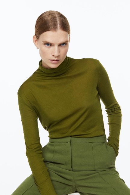
Fashion image provided by the author.
The COLOR CODEX series — to which SEMIOVOX has invited our semiotician colleagues from around the world to contribute — explores the unexpected associations evoked for each of us by specific colors found in the material world.
It’s the embodiment of equivocality.
A dull colour but also a warm colour, it’s a green toned down by yellow — which seems intuitively unlikely; why doesn’t the yellow brighten it up?
Its name reflects its purpose: the fabric of military uniforms, the colour of tanks. A quick Google search brings up jeeps, camouflage patterns, and helmets, but also olives, swimsuits, and nail polish. It is a colour of war, but also a colour of nature; it was chosen for war precisely because it blends in so well with the landscape. Before it was Army Green it was Earth Green — and it still is. As such, it was an essential part of Frank Lloyd Wright’s colour palette. His Prairie Style houses were decorated in autumnal shades of orange and olive. This reflected a Japanese influence, a desire to bring the outside inside, to honour the beauty of nature.
Army Green is also (like black, white, navy, and camel) a classic fashion colour. Many fashions, such as trench coats, are borrowed from the military, and colours (like navy blue) have been adopted by fashion as well. It has become a classic not despite but because of its drabness: It is not a statement colour; it is a little bit unassuming (despite being the colour of military aggression). It is the perfect foundational colour: It sets other colours off, and it also sets off people’s complexions. It is timeless: Like nature, like war, it will always be there.
My wardrobe is full of Army Green: pants, sweaters, swimsuits, jackets, dresses (although I try not to wear them all together). My first Army Green garment was a pair of cargo pants I got when I was 12 or 13. They made me feel older and tougher than the jeans and cords I had worn at 10 and 11. I was figuring out my style. Was I Preppy, was I New Wave? Army Green pants seemed open to both possibilities. I wore them one day with a turquoise Ralph Lauren polo shirt and another day with a Betty Boop tee. They looked great with both. Many years later I am still a little bit Preppy and a little bit New Wave; a little bit tough and a little bit of a hippie. I try never to be without Army Green in my life.
COLOR CODEX: Martha Arango (Sweden) on FALUKORV RED | Rachel Lawes (England) on DEVIL GREEN | Audrey Bartis (France) on KYOTO MOSS | Maciej Biedziński (Poland) on SKIN-DEEP ORANGE | Natasha Delliston (England) on MARRAKECH MINT | Whitney Dunlap-Fowler (USA) on RESURRECTION CANARY BLUE | Ximena Tobi (Argentina) on VILLA MISERIA BRICK | Aiyana Gunjan (India) on LETTERBOX RED | Lucia Laurent-Neva (England) on TEAL BLUE VOYAGER | Charles Leech (Canada) on STORMTROOPER WHITE | William Liu (China) on PINING GREEN | Ramona Lyons (USA) on GOTH PURPLE | Greg Rowland (England) on LAUNDROMAT FUTURA | Sónia Marques (Portugal) on RUNAWAY BURRO | Max Matus (Mexico) on CALIFORNIAN BLUE | Chirag Mediratta (Canada / India) on AUROVILLE ORANGE | Alfredo Troncoso (Mexico) on BORGES GLAUQUE | Josh Glenn (USA) on TOLKIEN GREEN | Clio Meurer (Brazil) on PARIS LUMINOUS GREY | Serdar Paktin (Turkey / England) on AMBIENT AMBER | Maria Papanthymou (Russia / Greece) on AGALMATOLITE WHITE | Sarah Johnson (Canada) on ARMY GREEN | Vijay Parthasarathy (USA) on ALPHONSO YELLOW | Tim Spencer (England) on ELECTRO-EROTIC COBALT | Adelina Vaca (Mexico) on MEXICAN PINK | Brian Khumalo (South Africa / USA) on STATUE OF LIBERTY TEAL | Madoka Suganuma (Japan) on BLOSSOM PINK | Susan Bell (Australia) on THAILAND TURQUOISE | Rajan Luthra (India) on AMALTAS YELLOW | Carla Moss (Austria) on EASTERN BLOC GREY | Dora Jurd de Girancourt (France) on JACARANDA PURPLE | Alexandra Ncube (England) on PMDD RED | Katrin Horn (Austria) on PIER BLUE | Ľudmila Lackova Bennett (Czech Republic) on BARBIE PINK | Onaiza Drabu (India) on TBD | Jiakun Wang (China) on GEN Z PURPLE | Manar R. El Wahsh (Canada) on TBD | Gianlluca Simi (Brazil) on TECH BLUE | Gemma Jones (Netherlands) on TBD | Mariane Cara (Brazil) on IPANEMA GOLDGLOW | Su Luo (China) on TBD | Jamin Pelkey (Canada) on KELLS CORAL | Cathy Maisano (Australia) on TBD | Hyaesook Yang (South Korea) on TBD | Hibato Ben Ahmed (France) on TBD | Eugene Gorny (Thailand) on BUDDHIST RED | Elinor Lifshitz (Switzerland) on TBD | Jessica Hamel Akré (France) on TBD | Iván Islas (Mexico) on MITLA YELLOW | Victoria Gerstman (Scotland) on TBD.
Also see these global semio series: MAKING SENSE (Q&As) | SEMIOFEST SESSIONS (monthly mini-conferences) | COVID CODES | SEMIO OBJECTS | COLOR CODEX | DECODER (fictional semioticians) | CASE FILE | PHOTO OP | MEDIA DIET | TATTOO YOU (semioticians’ tattoos).