Devil Green
The COLOR CODEX series — to which SEMIOVOX has invited our semiotician colleagues from around the world to contribute — explores the unexpected associations evoked for each of us by specific colors found in the material world.
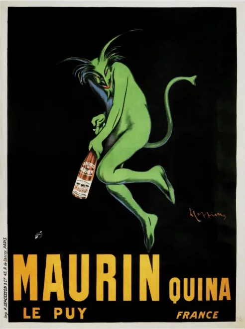
Here’s a green devil in an ad for a French cherry-, quinine-, and bitter almond-flavored liqueur. There’s a brand name (Maurin) in gold, the background is impenetrable night, and in the centre there’s a sprightly devil clutching the product with glee. It’s the kind of devil you’ve seen before: horns, forked tail, agile. But he’s green, and these kinds of devils are usually red. That got my attention.
Normally, green isn’t that daring. In my head, I can easily form a picture of Normal Green. You see, after 20+ years in marketing, I’ve been asked by clients, hundreds of times, to help them deploy the colour green in their marketing communications. Almost all of them want to leverage a reliable meaning: nature. The pleasant, easy kind. Countryside meadows in the spring. Blooming trees. The green you see on every food wrapper at your grocery store. Normal green is wholesome, safe and cosy. It might be a bit boring, depending on what you are selling and what else is going on with your brand. This is the dominant code of the colour green.
But there’s another side to green that is full of DANGER. It’s a spectrum within green, in fact, ranging from emerald to green olive. Our French devil in the picture is set just about mid-way between these two points.
At the emerald-green end is The Green Man of folklore. This is raw, powerful nature that may dispassionately kill you and tear down your house. Here’s the terrifying Green Knight encountered by Sir Gawain.
At the olive end is sickness. It’s more opaque and yellow. I thought I had a clear memory of the first time I noticed a devil represented in this sickly tint. I was playing Bioshock Infinite, art-directed by Scott Sinclair of Irrational Games. The game is set in the beautiful yet nightmarish city of Colombia. It floats in the sky. It is a home to a terrifying, fundamentalist religion that venerates the city’s founders. There are religiously themed posters and events everywhere. I was certain that I first noticed that devils sometimes arrive in a shade of sickly green when I was in that game. I have a photographic memory of it. But when I went to look for the dancing green demons in my screenshots, they were nowhere to be seen. So that’s why we are lucky that the Maurin Quina green devil was caught, because they can be evasive.
There’s danger here too, in this more olive green. It’s not that the devils will kill you outright like the Green Knight, but they may possess you, make you sick or appear undead. As I wrote this piece, there was a painting I wanted to look at which exemplifies this sickly green as the sign of illness. All I could remember was that it was German, it was a painting of Christ and he had a slightly green face. Unlike the devils of Bioshock, Christ revealed himself nearly instantly. It turned out that I was thinking of The Crucifixion by Matthias Grünewald, 1515. Christ is on the cross and he’s not only bleeding, he’s very unwell. He has lesions and greenish patches on his skin. It’s the central panel of the Isenheim Altarpiece, and was created for a monastery that was also a plague hospital, so as to offer comfort to the patients.
Why does all this matter to me? Because I like anomalies. I’m very attracted to things that sit just outside of the norms that my clients are constantly trying to exploit. Blue flowers. White heat. Green devils.
COLOR CODEX: Martha Arango (Sweden) on FALUKORV RED | Rachel Lawes (England) on DEVIL GREEN | Audrey Bartis (France) on KYOTO MOSS | Maciej Biedziński (Poland) on SKIN-DEEP ORANGE | Natasha Delliston (England) on MARRAKECH MINT | Whitney Dunlap-Fowler (USA) on RESURRECTION CANARY BLUE | Ximena Tobi (Argentina) on VILLA MISERIA BRICK | Aiyana Gunjan (India) on LETTERBOX RED | Lucia Laurent-Neva (England) on TEAL BLUE VOYAGER | Charles Leech (Canada) on STORMTROOPER WHITE | William Liu (China) on PINING GREEN | Ramona Lyons (USA) on GOTH PURPLE | Greg Rowland (England) on LAUNDROMAT FUTURA | Sónia Marques (Portugal) on RUNAWAY BURRO | Max Matus (Mexico) on CALIFORNIAN BLUE | Chirag Mediratta (Canada / India) on AUROVILLE ORANGE | Alfredo Troncoso (Mexico) on BORGES GLAUQUE | Josh Glenn (USA) on TOLKIEN GREEN | Clio Meurer (Brazil) on PARIS LUMINOUS GREY | Serdar Paktin (Turkey / England) on AMBIENT AMBER | Maria Papanthymou (Russia / Greece) on AGALMATOLITE WHITE | Sarah Johnson (Canada) on ARMY GREEN | Vijay Parthasarathy (USA) on ALPHONSO YELLOW | Tim Spencer (England) on ELECTRO-EROTIC COBALT | Adelina Vaca (Mexico) on MEXICAN PINK | Brian Khumalo (South Africa / USA) on STATUE OF LIBERTY TEAL | Madoka Suganuma (Japan) on BLOSSOM PINK | Susan Bell (Australia) on THAILAND TURQUOISE | Rajan Luthra (India) on AMALTAS YELLOW | Carla Moss (Austria) on EASTERN BLOC GREY | Dora Jurd de Girancourt (France) on JACARANDA PURPLE | Alexandra Ncube (England) on PMDD RED | Katrin Horn (Austria) on PIER BLUE | Ľudmila Lackova Bennett (Czech Republic) on BARBIE PINK | Onaiza Drabu (India) on TBD | Jiakun Wang (China) on GEN Z PURPLE | Manar R. El Wahsh (Canada) on TBD | Gianlluca Simi (Brazil) on TECH BLUE | Gemma Jones (Netherlands) on TBD | Mariane Cara (Brazil) on IPANEMA GOLDGLOW | Su Luo (China) on TBD | Jamin Pelkey (Canada) on KELLS CORAL | Cathy Maisano (Australia) on TBD | Hyaesook Yang (South Korea) on TBD | Hibato Ben Ahmed (France) on TBD | Eugene Gorny (Thailand) on BUDDHIST RED | Elinor Lifshitz (Switzerland) on TBD | Jessica Hamel Akré (France) on TBD | Iván Islas (Mexico) on MITLA YELLOW | Victoria Gerstman (Scotland) on TBD.
Also see these global semio series: MAKING SENSE (Q&As) | SEMIOFEST SESSIONS (monthly mini-conferences) | COVID CODES | SEMIO OBJECTS | COLOR CODEX | DECODER (fictional semioticians) | CASE FILE | PHOTO OP | MEDIA DIET | TATTOO YOU (semioticians’ tattoos).