Letterbox Red
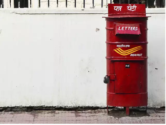
Image courtesy of the author
The COLOR CODEX series — to which SEMIOVOX has invited our semiotician colleagues from around the world to contribute — explores the unexpected associations evoked for each of us by specific colors found in the material world.
I wrote a letter to my mother / And on the way I dropped it / Someone came and picked it up / And put it in his pocket…
None of the birthday parties of my childhood would have been complete without playing the “Sent a Letter” game, which involved singing a song about letter-writing and mailing. For those of us who grew up in India during the 20th century, letter writing remained important into adulthood too — so the India Post’s red-painted letterboxes, for me, were emotionally omnipresent.
Our urban landscape, in those days and still today, is dotted with barrel-shaped letterboxes found in well-trafficked public locations, where people can drop their letters or postcards off to be collected and delivered by the government-operated postal system. Green boxes are meant for collection of local mail, while red boxes are for mail that is not local. Every time I’d pass a red letterbox it would invite me to keep in touch with distant family and friends. In the pre-email, pre-mobile era, the red letterbox was our sole connection; we trusted the red letterbox, implicitly, to keep us in touch.
In particular, the red letterbox evokes memories of my summer holidays, when we’d leave our friends in Delhi behind and go to visit my grandparents. In town, I’d chat with my friends every day by telephone — but long-distance trunk calls were too expensive. So all our sharing, talking, discussing, exchanging notes, gossiping… during those long months of summer, it could only happen through letter writing. Not only writing the letter itself, but sealing the envelope, pasting on a stamp, then walking down the road to the faithful red letterbox became a sacrosanct ritual. The letterbox was a partner in that ritual — one that I could always trust, because it never let me down.
I’ve written so many stories, thoughts, and emotions in letters that I’ve then dropped into a red letterbox. Its color, therefore, for me has come to symbolize more than merely “mail.” it symbolizes the power of my voice, and my yearning for those who live far away. The red of the letterbox is in perfect sync with the red symbol of a loving heart.
COLOR CODEX: Martha Arango (Sweden) on FALUKORV RED | Rachel Lawes (England) on DEVIL GREEN | Audrey Bartis (France) on KYOTO MOSS | Maciej Biedziński (Poland) on SKIN-DEEP ORANGE | Natasha Delliston (England) on MARRAKECH MINT | Whitney Dunlap-Fowler (USA) on RESURRECTION CANARY BLUE | Ximena Tobi (Argentina) on VILLA MISERIA BRICK | Aiyana Gunjan (India) on LETTERBOX RED | Lucia Laurent-Neva (England) on TEAL BLUE VOYAGER | Charles Leech (Canada) on STORMTROOPER WHITE | William Liu (China) on PINING GREEN | Ramona Lyons (USA) on GOTH PURPLE | Greg Rowland (England) on LAUNDROMAT FUTURA | Sónia Marques (Portugal) on RUNAWAY BURRO | Max Matus (Mexico) on CALIFORNIAN BLUE | Chirag Mediratta (Canada / India) on AUROVILLE ORANGE | Alfredo Troncoso (Mexico) on BORGES GLAUQUE | Josh Glenn (USA) on TOLKIEN GREEN | Clio Meurer (Brazil) on PARIS LUMINOUS GREY | Serdar Paktin (Turkey / England) on AMBIENT AMBER | Maria Papanthymou (Russia / Greece) on AGALMATOLITE WHITE | Sarah Johnson (Canada) on ARMY GREEN | Vijay Parthasarathy (USA) on ALPHONSO YELLOW | Tim Spencer (England) on ELECTRO-EROTIC COBALT | Adelina Vaca (Mexico) on MEXICAN PINK | Brian Khumalo (South Africa / USA) on STATUE OF LIBERTY TEAL | Madoka Suganuma (Japan) on BLOSSOM PINK | Susan Bell (Australia) on THAILAND TURQUOISE | Rajan Luthra (India) on AMALTAS YELLOW | Carla Moss (Austria) on EASTERN BLOC GREY | Dora Jurd de Girancourt (France) on JACARANDA PURPLE | Alexandra Ncube (England) on PMDD RED | Katrin Horn (Austria) on PIER BLUE | Ľudmila Lackova Bennett (Czech Republic) on BARBIE PINK | Onaiza Drabu (India) on MOHARRAM BLACK | Jiakun Wang (China) on GEN Z PURPLE | Manar R. El Wahsh (Canada) on TBD | Gianlluca Simi (Brazil) on TECH BLUE | Gemma Jones (Netherlands) on IN-BETWEEN INDIGO | Mariane Cara (Brazil) on IPANEMA GOLDGLOW | Su Luo (China) on TBD | Jamin Pelkey (Canada) on KELLS CORAL | Cathy Maisano (Australia) on TBD | Hyaesook Yang (South Korea) on TBD | Hibato Ben Ahmed (France) on TBD | Eugene Gorny (Thailand) on BUDDHIST RED | Elinor Lifshitz (Switzerland) on TBD | Jessica Hamel Akré (France) on TBD | Iván Islas (Mexico) on MITLA YELLOW | Victoria Gerstman (Scotland) on TBD.
Also see these global semio series: MAKING SENSE (Q&As) | SEMIOFEST SESSIONS (monthly mini-conferences) | COVID CODES | SEMIO OBJECTS | COLOR CODEX | DECODER (fictional semioticians) | CASE FILE | PHOTO OP | MEDIA DIET | TATTOO YOU (semioticians’ tattoos).