Borges Glauque
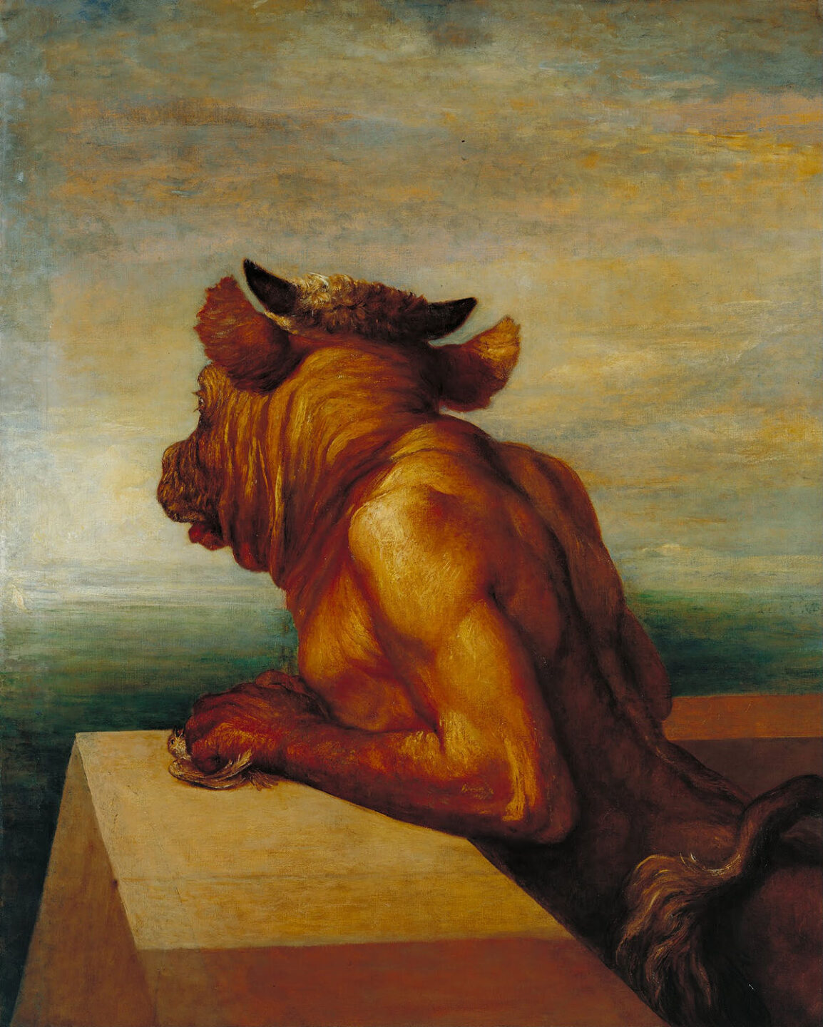
The Minotaur is an 1885 painting by George Frederic Watts.
The COLOR CODEX series — to which SEMIOVOX has invited our semiotician colleagues from around the world to contribute — explores the unexpected associations evoked for each of us by specific colors found in the material world.
As a child growing up in Montevideo, I developed a curious fixation with the elusive hues of the “river-sea,” the Río de la Plata. Sometimes a muddy brown, others a deep Atlantic blue, but for the most part, an ever changing grayish, greenish blue that defied my childish efforts at representation with a 12-pencil color set.
Ever since, I have had little patience for the primary colors dogma and its abhorrent offshoot, the tertiary color catalogue; a color is not a thing! Far from tertiary indecisiveness, I am always on the lookout for that murky, transient green which in my mind is the decidedly ambiguous color of mystery.
I have found some approximations in some coppery stone slabs in Oaxaca, a few marble walls here and there, some ’80s car paint that was, however, too uniformly bright. Closer to the present, I’ve thought I’d seen it in some soaps and fashionable drinks. But I have always known these to be poor approximations.
I confirmed this after an encounter with the dense refractions of Watt’s Minotaur at the old Tate Gallery. The Hellenic subject matter seems to have led to further clarification: on the one hand, I learned that for the Ancient Greeks there was no such thing as blue, just gray green manifestations of Glaukos. On the other, that Borges himself had been bewildered by the helpless melancholia of that Minotaur[1]. From there it was just a further step to conclusive confirmation in the words of the blind author of Poem of the Gifts.
Glaucoma runs in my family so I was ready for the question concerning what it is that the blind see. When I read Borges’ answer[2], namely, that he lived in the center of a gray bluish mist, I knew for certain that he was talking about my color. I call it Borges Glauque.
[1] In The House of Asterion
[2] In a collection of American interviews published as Borges at 80.
COLOR CODEX: Martha Arango (Sweden) on FALUKORV RED | Rachel Lawes (England) on DEVIL GREEN | Audrey Bartis (France) on KYOTO MOSS | Maciej Biedziński (Poland) on SKIN-DEEP ORANGE | Natasha Delliston (England) on MARRAKECH MINT | Whitney Dunlap-Fowler (USA) on RESURRECTION CANARY BLUE | Ximena Tobi (Argentina) on VILLA MISERIA BRICK | Aiyana Gunjan (India) on LETTERBOX RED | Lucia Laurent-Neva (England) on TEAL BLUE VOYAGER | Charles Leech (Canada) on STORMTROOPER WHITE | William Liu (China) on PINING GREEN | Ramona Lyons (USA) on GOTH PURPLE | Greg Rowland (England) on LAUNDROMAT FUTURA | Sónia Marques (Portugal) on RUNAWAY BURRO | Max Matus (Mexico) on CALIFORNIAN BLUE | Chirag Mediratta (Canada / India) on AUROVILLE ORANGE | Alfredo Troncoso (Mexico) on BORGES GLAUQUE | Josh Glenn (USA) on TOLKIEN GREEN | Clio Meurer (Brazil) on PARIS LUMINOUS GREY | Serdar Paktin (Turkey / England) on AMBIENT AMBER | Maria Papanthymou (Russia / Greece) on AGALMATOLITE WHITE | Sarah Johnson (Canada) on ARMY GREEN | Vijay Parthasarathy (USA) on ALPHONSO YELLOW | Tim Spencer (England) on ELECTRO-EROTIC COBALT | Adelina Vaca (Mexico) on MEXICAN PINK | Onaiza Drabu (India) on TBD | Brian Khumalo (South Africa / USA) on TBD | Ľudmila Lackova Bennett (Czech Republic) on TBD | Gemma Jones (Netherlands) on TBD | Madoka Suganuma (Japan) on BLOSSOM PINK | Cathy Maisano (Australia) on TBD | Jiakun Wang (China) on GEN Z PURPLE | Gianlluca SImi (Brazil) on TECH BLUE | Susan Bell (Australia) on TBD | Jamin Pelkey (Canada) on TBD | Manar R. El Wahsh (Canada) on TBD | Alexandra Ncube (England) on TBD | Dora Jurd de Girancourt (France) on TBD | Carla Moss (Austria) on TBD | Mariane Cara (Brazil) on IPANEMA GOLDGLOW | Katrin Horn (Austria) on TBD | Rajan Luthra (India) on TBD | Hyaesook Yang (South Korea) on TBD | Hibato Ben Ahmed (France) on TBD | Eugene Gorny (Thailand) on BUDDHIST RED | Elinor Lifshitz (Switzerland) on TBD | Jessica Hamel Akré (France) on TBD
Also see these global semio series: MAKING SENSE (Q&As) | SEMIOFEST SESSIONS (monthly mini-conferences) | COVID CODES | SEMIO OBJECTS | COLOR CODEX | DECODER (fictional semioticians) | CASE FILE | PHOTO OP | MEDIA DIET | TATTOO YOU (semioticians’ tattoos).