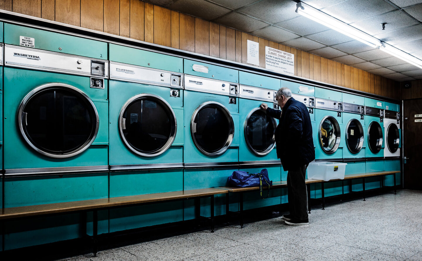
Laundromat Futura

London's Barbican Launderette
The COLOR CODEX series — to which SEMIOVOX has invited our semiotician colleagues from around the world to contribute — explores the unexpected associations evoked for each of us by specific colors found in the material world.
As a child bored out of my wits at the laundromat, I derived some kind of mechanical-futurist excitement from pressing the buttons of the big aquamarine machines. Looking back, I now understand that my association of aquamarine with science fiction must have been conditioned by the 1964–1965 British children’s sci-fi show Stingray — a “supermarionation” puppet series following the adventures of the World Aquanaut Security Patrol, whose combat submarine sported aquamarine highlights.
Incidentally or not, this was the first British TV program filmed entirely in color. I can’t be the only person my age to have been deeply influenced.
The submarine’s color was supposed to make viewers think of the sea, but the ocean around the British isles is a dark and yucky green, stinky and putrid… so instead, at least one Stingray fan, though probably many more as well, came to associate the color aquamarine with a clean, shiny futurism. More on the sea shortly.
In the course of my thirty glorious years as a commercial semiotician, I’ve been asked innumerable times to state definitively what a particular color means. Every time, I’ve hemmed and hawed, obfuscated and swerved. “It depends…” is what I always say. How can we even begin to define a color’s meaning? The same color employed by Matisse or Miró, or projected from a star whose light is reaching us a billion years later, or spotted on a discarded, oleaginous Wendy’s hamburger wrapper… the mind boggles. The more our work resembles astrology or pop-Freudian dream analysis, the happier clients are. But outside of the context of a particular cultural territory or product category, the meaning of a color can only be autobiographical. Hence the following reminiscence.
In the mid-1990s, my bandmates and I often crossed the English Channel from Dover to Calais, seeking our fortunes in the jazz-funk dives of Paris. (Why did we travel by water? It was the only way to transport my back-breaking authentic 1973 Fender Rhodes electric piano.) On one particular voyage, our ferry battled Poseidon for every inch of progress across those all-too-unaquamarine waves. My discomfort that morning was magnified by a terrible hangover, because — for reasons unfathomed, then and now — a trumpeter named Ralph had plied me with claret. On the poop deck, scoured by the brazen winds, the claret departed from my person with considerable vigor… accompanied by the screams of a troop of picture-perfect Parisian, Mathilda-esque schoolchildren. (One suspects that their yelps of revulsion still echo across the ferry’s deck.) As the claret poured down the ship’s scuppers, the girls’ elegant teacher shot me a scowl of disgust that still stings today.
In her horror, did the teacher retreat into a happy place, perhaps a school’s art room, one decorated with a color-wheel poster? Might she have pictured the color “claret” on that color wheel, and — in seeking an antithetical experience to the horrible one that a boorish Englishman was providing her — might she have imagined claret’s “complementary” (opposite) color? If so, then at that moment my vomiting caused her to picture… aquamarine.

COLOR CODEX: Martha Arango (Sweden) on FALUKORV RED | Rachel Lawes (England) on DEVIL GREEN | Audrey Bartis (France) on KYOTO MOSS | Maciej Biedziński (Poland) on SKIN-DEEP ORANGE | Natasha Delliston (England) on MARRAKECH MINT | Whitney Dunlap-Fowler (USA) on RESURRECTION CANARY BLUE | Ximena Tobi (Argentina) on VILLA MISERIA BRICK | Aiyana Gunjan (India) on LETTERBOX RED | Lucia Laurent-Neva (England) on TEAL BLUE VOYAGER | Charles Leech (Canada) on STORMTROOPER WHITE | William Liu (China) on PINING GREEN | Ramona Lyons (USA) on GOTH PURPLE | Greg Rowland (England) on LAUNDROMAT FUTURA | Sónia Marques (Portugal) on RUNAWAY BURRO | Max Matus (Mexico) on CALIFORNIAN BLUE | Chirag Mediratta (Canada / India) on AUROVILLE ORANGE | Alfredo Troncoso (Mexico) on BORGES GLAUQUE | Josh Glenn (USA) on TOLKIEN GREEN | Clio Meurer (Brazil) on PARIS LUMINOUS GREY | Serdar Paktin (Turkey / England) on AMBIENT AMBER | Maria Papanthymou (Russia / Greece) on AGALMATOLITE WHITE | Sarah Johnson (Canada) on ARMY GREEN | Vijay Parthasarathy (USA) on ALPHONSO YELLOW | Tim Spencer (England) on ELECTRO-EROTIC COBALT | Adelina Vaca (Mexico) on MEXICAN PINK | Onaiza Drabu (India) on TBD | Brian Khumalo (South Africa / USA) on TBD | Ľudmila Lackova Bennett (Czech Republic) on TBD | Gemma Jones (Netherlands) on TBD | Madoka Suganuma (Japan) on BLOSSOM PINK | Cathy Maisano (Australia) on TBD | Jiakun Wang (China) on GEN Z PURPLE | Gianlluca SImi (Brazil) on TECH BLUE | Susan Bell (Australia) on TBD | Jamin Pelkey (Canada) on TBD | Manar R. El Wahsh (Canada) on TBD | Alexandra Ncube (England) on TBD | Dora Jurd de Girancourt (France) on TBD | Carla Moss (Austria) on TBD | Mariane Cara (Brazil) on IPANEMA GOLDGLOW | Katrin Horn (Austria) on TBD | Rajan Luthra (India) on TBD | Hyaesook Yang (South Korea) on TBD | Hibato Ben Ahmed (France) on TBD | Eugene Gorny (Thailand) on BUDDHIST RED | Elinor Lifshitz (Switzerland) on TBD | Jessica Hamel Akré (France) on TBD
Also see these global semio series: MAKING SENSE (Q&As) | SEMIOFEST SESSIONS (monthly mini-conferences) | COVID CODES | SEMIO OBJECTS | COLOR CODEX | DECODER (fictional semioticians) | CASE FILE | PHOTO OP | MEDIA DIET | TATTOO YOU (semioticians’ tattoos).

