

Barbie Pink
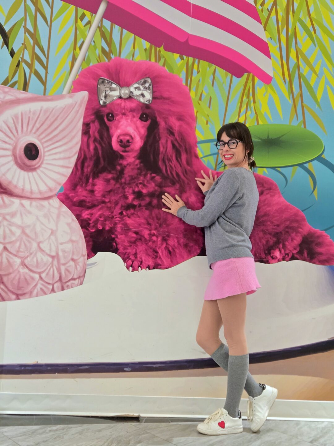
Photo courtesy of the author. Photo credit: Jamin Pelkey.
The COLOR CODEX series — to which SEMIOVOX has invited 50 of our commercial / applied semiotician colleagues from around the world to contribute — explores the unexpected associations evoked for each of us by specific colors found in the material world. Vol. 1: 2023–24. Vol. 2: 2026–27.
Color-coding is a fascinating cultural phenomenon. It is one of the topics I am most often asked about by first-year students in our Semiotics program, or by anyone who knows that I work in semiotics. The question usually sounds deceptively simple: “What does this color mean?” The answer, of course, is that colors do not have fixed meanings. Cultural color-coding changes across time and space, both geographically and historically. What fascinates me is not only how these meanings emerge, but also how strongly people become attached to them.
In this article, I want to talk about Barbie Pink. As Associate Dean for External Relations at the Faculty of Humanities, Charles University, I have been involved in designing promotional campaigns for our study programs. We are one of the very few universities in Europe that offer a graduate program in Gender Studies. When preparing promotional materials for the program, it seemed perfectly natural to me to use a Barbie-pink color palette. I was surprised by the strong resistance this idea generated. Members of the program objected immediately: anything but pink. Some suggested a compromise: “Could you at least make it an off-pink shade?” The argument was that pink is associated with traditional femininity and gender stereotypes and therefore should not appear in an advertisement for a Gender Studies program. Purple, I was told, would be more appropriate because of its association with gender fluidity and non-binary identities.
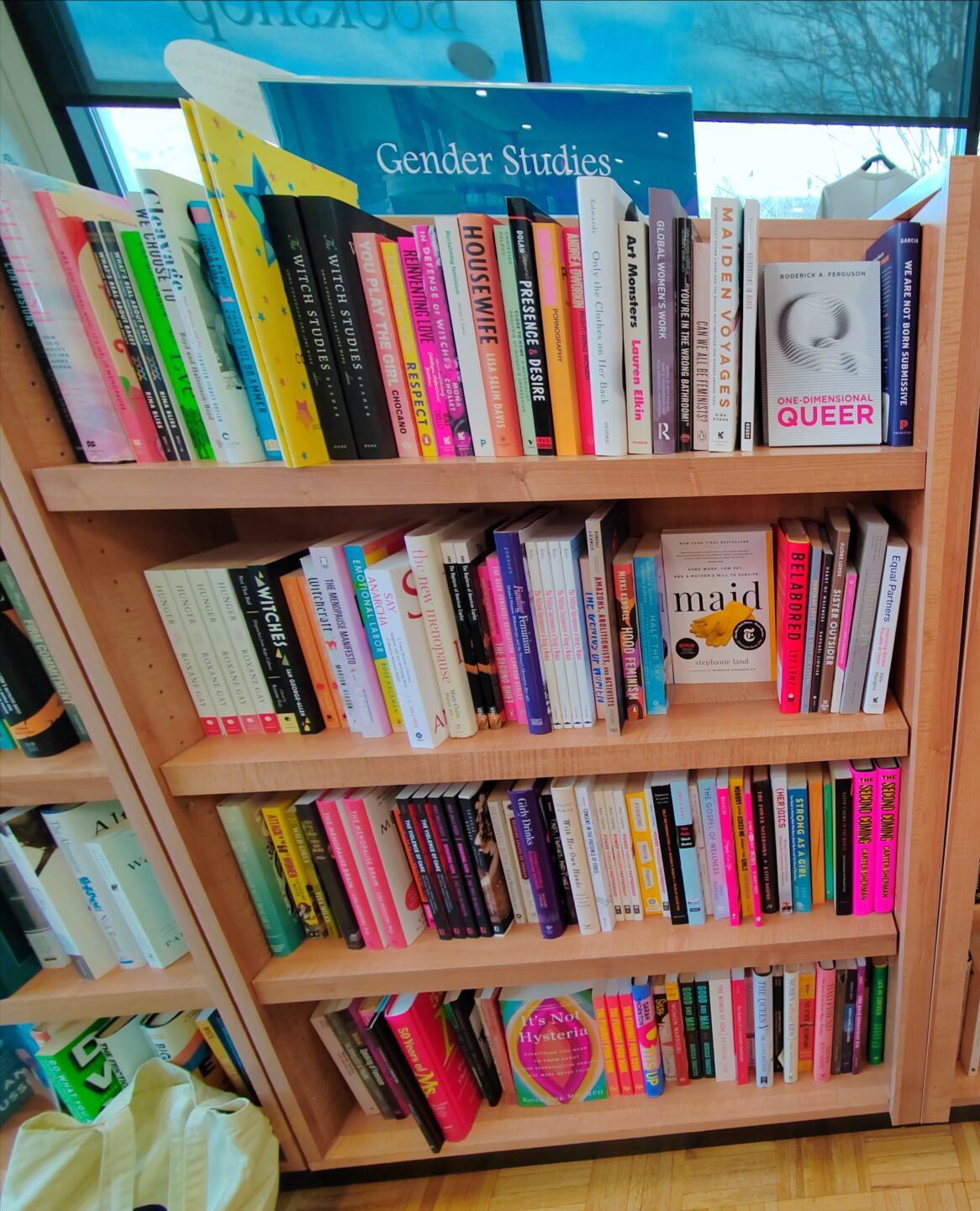
What struck me most was how little room there seemed to be for irony, playfulness, or semiotic subversion within academia. After all, many feminists around the world deliberately wear pink precisely because it is so heavily associated with conventional gender roles. Reclaiming a symbol can be a powerful political gesture. The history of pink itself is much more complex than contemporary assumptions suggest. During the eighteenth and nineteenth centuries, pink was often recommended for young boys, while blue was considered more suitable for girls. More importantly, pink continues to be used intentionally in feminist and gender-related contexts. Many books on gender studies feature pink covers precisely because the color invites reflection on the social construction of gender. The photograph shared here was taken in the Gender Studies section of the Duke University bookstore. The prevalence of pink was striking — not despite its gendered associations, but because of them.
As a young woman in leadership positions, I have encountered my share of sexism. Experiences like these have only reinforced my decision to wear pink. I like pink. More importantly, I believe it is important that emancipated women feel free to wear pink if they wish. Color-coding shapes our visual identities. If feminism is about expanding freedom and choice, then it should include the freedom to embrace symbols traditionally associated with femininity without fear of being perceived as less serious, less intellectual, or less emancipated. How can anyone feel comfortable in their womanhood if they are expected to distance themselves from every symbol culturally associated with being a woman?
COLOR CODEX: Martha Arango (Sweden) on FALUKORV RED | Rachel Lawes (England) on DEVIL GREEN | Audrey Bartis (France) on KYOTO MOSS | Maciej Biedziński (Poland) on SKIN-DEEP ORANGE | Natasha Delliston (England) on MARRAKECH MINT | Whitney Dunlap-Fowler (USA) on RESURRECTION CANARY BLUE | Ximena Tobi (Argentina) on VILLA MISERIA BRICK | Aiyana Gunjan (India) on LETTERBOX RED | Lucia Laurent-Neva (England) on TEAL BLUE VOYAGER | Charles Leech (Canada) on STORMTROOPER WHITE | William Liu (China) on PINING GREEN | Ramona Lyons (USA) on GOTH PURPLE | Greg Rowland (England) on LAUNDROMAT FUTURA | Sónia Marques (Portugal) on RUNAWAY BURRO | Max Matus (Mexico) on CALIFORNIAN BLUE | Chirag Mediratta (Canada / India) on AUROVILLE ORANGE | Alfredo Troncoso (Mexico) on BORGES GLAUQUE | Josh Glenn (USA) on TOLKIEN GREEN | Clio Meurer (Brazil) on PARIS LUMINOUS GREY | Serdar Paktin (Turkey / England) on AMBIENT AMBER | Maria Papanthymou (Russia / Greece) on AGALMATOLITE WHITE | Sarah Johnson (Canada) on ARMY GREEN | Vijay Parthasarathy (USA) on ALPHONSO YELLOW | Tim Spencer (England) on ELECTRO-EROTIC COBALT | Adelina Vaca (Mexico) on MEXICAN PINK | Brian Khumalo (South Africa / USA) on STATUE OF LIBERTY TEAL | Madoka Suganuma (Japan) on BLOSSOM PINK | Susan Bell (Australia) on THAILAND TURQUOISE | Rajan Luthra (India) on AMALTAS YELLOW | Carla Moss (Austria) on EASTERN BLOC GREY | Dora Jurd de Girancourt (France) on JACARANDA PURPLE | Alexandra Ncube (England) on PMDD RED | Katrin Horn (Austria) on PIER BLUE | Ľudmila Lackova Bennett (Czech Republic) on BARBIE PINK | Onaiza Drabu (India) on MOHARRAM BLACK | Jamin Pelkey (Canada) on KELLS CORAL | Manar R. El Wahsh (Canada) on FATIMID GOLD | Gianlluca Simi (Brazil) on ELLE IN BLUE | Jiakun Wang (China) on GEN Z PURPLE | Mariane Cara (Brazil) on IPANEMA GOLDGLOW | Eugene Gorny (Thailand) on FLAMBOYANT RED | Gemma Jones (Netherlands) on IN-BETWEEN INDIGO | Cathy Maisano (Australia) on AUSTRALIAN SUNSET | Victoria Gerstman (Scotland) on CALPOL PURPLE | Iván Islas (Mexico) on MITLA YELLOW | Su Luo (China) on CHILLI OIL RED | Nimesh Nambiar (UAE) on DUBAI DUNES | Hyaesook Yang (South Korea) on THE INTERSTICE GRADIENT | Alice Sweitzer (Germany) on HÖR GREEN | Elinor Lifshitz (Switzerland) on BAMBOO GREEN.
Also see these global semio series: MAKING SENSE (Q&As) | SEMIOFEST SESSIONS (monthly mini-conferences) | COVID CODES | SEMIO OBJECTS | COLOR CODEX | DECODER (fictional semioticians) | CASE FILE | PHOTO OP | MEDIA DIET | TATTOO YOU (semioticians’ tattoos).