

Flamboyant Red
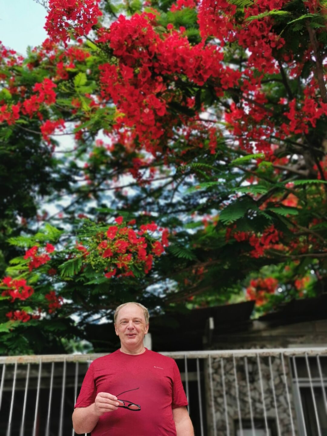
Photo courtesy of the author
The COLOR CODEX series — to which SEMIOVOX has invited 50 of our commercial / applied semiotician colleagues from around the world to contribute — explores the unexpected associations evoked for each of us by specific colors found in the material world. Vol. 1: 2023–24. Vol. 2: 2026–27.
After death, I would like to become this tree.
I clearly remember the first time I encountered it. I was living in Chiang Mai then and one day decided to ride my motorbike to Mae Rim. Along the road stood trees bursting with bright red flowers. There were so many flowers that the foliage was barely visible behind them. There were many trees, too, and together they formed an unbroken blaze.
I was struck by the beauty of the sight. But even more by the intensity of feeling born of the intensity of color.
The red shifted through scarlet and orange, at times almost crimson. Yet it did not exist on its own. The light, feathery foliage broke up the mass of red; blue sky showed through the green; the three colors entered one another while remaining distinct. Red predominated, green brought it to life, and blue gave it depth. It was not a tree against the sky, but a single chromatic event.
And silence, like the World Tree, gently sways,
Its leaves and roots are stirring, soft and slow.
Through green it blues, with scarlet blooms ablaze,
It pierces spirit, sets the soul aglow.
Later, I examined the flower closely. Four of its petals are scarlet or orange-red. The fifth, larger and raised, is marked with white and yellow streaks, as though the flame had reached a higher temperature there. The flower is waxy, dense, palpably material. Yet the crown, composed of thousands of such flowers, seems weightless.
What I call Buddhist Red is different: the deep reds of Thai temples — vermilion, crimson, and kindred shades. It does not flare but endures; does not pierce but sustains. Yet Buddhist Red and the red of the Flame Tree are not opposed. I lived for a long time in Thai wats and loved seeing the two together. One color condenses intensity; the other shares it without reserve.
Color itself, of course, contains no ready-made emotion that can be extracted from it like an object from a box. The color has to meet something in the person who sees it. When that happens, the tree becomes not an object of vision but the very way of seeing.
This tree has many names: Delonix regia, Royal Poinciana, Flamboyant, Flame Tree. Other languages have still more, but most gravitate toward four images: fire, peacock, royalty, paradise. All are forms of transcendence. Fire releases form from weight. Royalty rises above the ordinary. The peacock’s splendor laughs at measure and utility. Paradise is a beautiful garden where trees with fiery flowers grow.
In Thailand, the Flamboyant is called หางนกยูงฝรั่ง (hang nok yung farang), “the tail of the foreign peacock.” Just “peacock tail”—หางนกยูง (hang nok yung)—refers to Caesalpinia pulcherrima, a shrub with similar red flowers. Farang here means “foreign.” I too am a farang—that makes us kin.
Why this particular tree?
Maple makes withering dazzling. Its red belongs to autumn: the color of transformation and departure.
Oak is the fullness of earthly existence. Weight, strength, rootedness, a body that needs no justification before the spirit.
Sequoia ushers us into geological time. Beside it, human life seems brief, ephemeral.
The Bodhi tree preserves the memory of awakening.
The banyan erases the boundary between the one and the many.
Sakura makes transience visible and turns disappearance into celebration.
The Flame Tree blooms in the hottest season. It needs no withering to become red; no antiquity to become great; no enlightenment to become sacred. It does not teach us to die, take root, endure, or awaken.
It simply blooms with flowers of fire.
Damp, windy weather. So unlike the usual sunshine—as though one had set out on a journey. Leaves rustling, water rippling, air humming among the columns. A sense of being lost and found at once.
The flowers of the Flame Tree fall. Gather a handful and lift them to your nose, and you can hear their scent—complex, astringent, quiet. The scent of a life lived and unlived, of what has been repressed and forgotten, of the piercing and the impossible.
Under medication’s influence,
I watch the clouds as they drift and flow.
This cotton pleads its innocence:
Shishel-myshel came—and off he’d go.
The sea whispers rhythmically.
A bird rings out like a saw.
Our personal is impersonal,
A headless cowboy, wild and raw.
With fiery flowers on the tree,
Ignoring title and rank,
It delights both you and me—
Hang-nok-yung-farang.
COLOR CODEX: Martha Arango (Sweden) on FALUKORV RED | Rachel Lawes (England) on DEVIL GREEN | Audrey Bartis (France) on KYOTO MOSS | Maciej Biedziński (Poland) on SKIN-DEEP ORANGE | Natasha Delliston (England) on MARRAKECH MINT | Whitney Dunlap-Fowler (USA) on RESURRECTION CANARY BLUE | Ximena Tobi (Argentina) on VILLA MISERIA BRICK | Aiyana Gunjan (India) on LETTERBOX RED | Lucia Laurent-Neva (England) on TEAL BLUE VOYAGER | Charles Leech (Canada) on STORMTROOPER WHITE | William Liu (China) on PINING GREEN | Ramona Lyons (USA) on GOTH PURPLE | Greg Rowland (England) on LAUNDROMAT FUTURA | Sónia Marques (Portugal) on RUNAWAY BURRO | Max Matus (Mexico) on CALIFORNIAN BLUE | Chirag Mediratta (Canada / India) on AUROVILLE ORANGE | Alfredo Troncoso (Mexico) on BORGES GLAUQUE | Josh Glenn (USA) on TOLKIEN GREEN | Clio Meurer (Brazil) on PARIS LUMINOUS GREY | Serdar Paktin (Turkey / England) on AMBIENT AMBER | Maria Papanthymou (Russia / Greece) on AGALMATOLITE WHITE | Sarah Johnson (Canada) on ARMY GREEN | Vijay Parthasarathy (USA) on ALPHONSO YELLOW | Tim Spencer (England) on ELECTRO-EROTIC COBALT | Adelina Vaca (Mexico) on MEXICAN PINK | Brian Khumalo (South Africa / USA) on STATUE OF LIBERTY TEAL | Madoka Suganuma (Japan) on BLOSSOM PINK | Susan Bell (Australia) on THAILAND TURQUOISE | Rajan Luthra (India) on AMALTAS YELLOW | Carla Moss (Austria) on EASTERN BLOC GREY | Dora Jurd de Girancourt (France) on JACARANDA PURPLE | Alexandra Ncube (England) on PMDD RED | Katrin Horn (Austria) on PIER BLUE | Ľudmila Lackova Bennett (Czech Republic) on BARBIE PINK | Onaiza Drabu (India) on MOHARRAM BLACK | Jamin Pelkey (Canada) on KELLS CORAL | Manar R. El Wahsh (Canada) on FATIMID GOLD | Gianlluca Simi (Brazil) on ELLE IN BLUE | Jiakun Wang (China) on GEN Z PURPLE | Mariane Cara (Brazil) on IPANEMA GOLDGLOW | Eugene Gorny (Thailand) on FLAMBOYANT RED | Gemma Jones (Netherlands) on IN-BETWEEN INDIGO | Cathy Maisano (Australia) on AUSTRALIAN SUNSET | Victoria Gerstman (Scotland) on CALPOL PURPLE | Iván Islas (Mexico) on MITLA YELLOW | Su Luo (China) on CHILLI OIL RED | Nimesh Nambiar (UAE) on DUBAI DUNES | Hyaesook Yang (South Korea) on THE INTERSTICE GRADIENT | Alice Sweitzer (Germany) on HÖR GREEN | Elinor Lifshitz (Switzerland) on BAMBOO GREEN.
Also see these global semio series: MAKING SENSE (Q&As) | SEMIOFEST SESSIONS (monthly mini-conferences) | COVID CODES | SEMIO OBJECTS | COLOR CODEX | DECODER (fictional semioticians) | CASE FILE | PHOTO OP | MEDIA DIET | TATTOO YOU (semioticians’ tattoos).