

Pier Blue
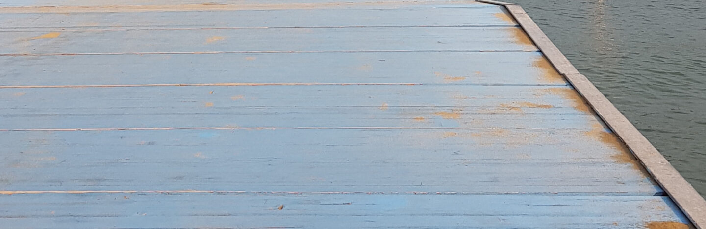
Photo courtesy of the author
The COLOR CODEX series — to which SEMIOVOX has invited 50 of our commercial / applied semiotician colleagues from around the world to contribute — explores the unexpected associations evoked for each of us by specific colors found in the material world. Vol. 1: 2023–24. Vol. 2: 2026–27.
They say blue is the colour of the sea. Yet anyone who spends time near the sea knows it is restless in its colours: white where the waves break, green in the shallow pools, turquoise in sunlight, slate under clouds, silver at dawn, almost black when a storm threatens. Rarely is it just blue.
For me, though, one blue remained constant. The faded blue of an Italian pier.
When the kids were little, we spent our summer holidays in the same small town on Italy’s Adriatic coast. First, my husband had spent his childhood holidays there, and then our children spent theirs at the same place. We had already lived in three countries with them: addresses changed, schools changed. The sea changed. But the pier was always there. Every summer, we returned. Exhausted from a year of work and school and change, we arrived – and when our bare feet touched the pier, we knew we were there.
The pier was made of wood and painted in what used to be a bright Mediterranean blue. For the first stretch, there was no railing, and later, only a token banister. The pier never pretended to make the sea safe. The responsibility is yours, but so is the freedom of standing there. It stretched across the water that was never the same colour twice, its faded blue paint set against the sea’s constant variability. I remember the feeling of the wood under my feet: warm, battered by sand, sun and sea, but still strong.
The sea was movement, variation, change. Its many colours reflected that restlessness. Our life was like the sea. Kids grew taller, we grew older. Jobs changed. But the Italian holidays stayed. The pier stayed. Blue and permanent, a stable bridge across a sea of change and a million colours, it stayed from one summer to the next, and even across generations.
One day in autumn, we decided to paint a wooden divider wall in our garage in the exact faded blue of the pier. We wanted to bring home not the idealised blue of the Mediterranean sea, but the actual blue of the weathered wood of the Italian pier, warm from the sun, worn out from the salt.
A couple of years ago, the pier was renovated. Its wooden planks were replaced with blue glass-fibre panels. The colour remains, but it will no longer fade in the same way. The weathered blue of our family holidays exists now mostly in our memory.
The sea is never really blue. It is white and green and silver and black, changing from hour to hour. The pier is still blue, but not quite in the same way. The faded blue I remember stays with me — in my garage and in my mind: the true colour of a sea that is never just blue.
COLOR CODEX: Martha Arango (Sweden) on FALUKORV RED | Rachel Lawes (England) on DEVIL GREEN | Audrey Bartis (France) on KYOTO MOSS | Maciej Biedziński (Poland) on SKIN-DEEP ORANGE | Natasha Delliston (England) on MARRAKECH MINT | Whitney Dunlap-Fowler (USA) on RESURRECTION CANARY BLUE | Ximena Tobi (Argentina) on VILLA MISERIA BRICK | Aiyana Gunjan (India) on LETTERBOX RED | Lucia Laurent-Neva (England) on TEAL BLUE VOYAGER | Charles Leech (Canada) on STORMTROOPER WHITE | William Liu (China) on PINING GREEN | Ramona Lyons (USA) on GOTH PURPLE | Greg Rowland (England) on LAUNDROMAT FUTURA | Sónia Marques (Portugal) on RUNAWAY BURRO | Max Matus (Mexico) on CALIFORNIAN BLUE | Chirag Mediratta (Canada / India) on AUROVILLE ORANGE | Alfredo Troncoso (Mexico) on BORGES GLAUQUE | Josh Glenn (USA) on TOLKIEN GREEN | Clio Meurer (Brazil) on PARIS LUMINOUS GREY | Serdar Paktin (Turkey / England) on AMBIENT AMBER | Maria Papanthymou (Russia / Greece) on AGALMATOLITE WHITE | Sarah Johnson (Canada) on ARMY GREEN | Vijay Parthasarathy (USA) on ALPHONSO YELLOW | Tim Spencer (England) on ELECTRO-EROTIC COBALT | Adelina Vaca (Mexico) on MEXICAN PINK | Brian Khumalo (South Africa / USA) on STATUE OF LIBERTY TEAL | Madoka Suganuma (Japan) on BLOSSOM PINK | Susan Bell (Australia) on THAILAND TURQUOISE | Rajan Luthra (India) on AMALTAS YELLOW | Carla Moss (Austria) on EASTERN BLOC GREY | Dora Jurd de Girancourt (France) on JACARANDA PURPLE | Alexandra Ncube (England) on PMDD RED | Katrin Horn (Austria) on PIER BLUE | Ľudmila Lackova Bennett (Czech Republic) on BARBIE PINK | Onaiza Drabu (India) on MOHARRAM BLACK | Jamin Pelkey (Canada) on KELLS CORAL | Manar R. El Wahsh (Canada) on FATIMID GOLD | Gianlluca Simi (Brazil) on ELLE IN BLUE | Jiakun Wang (China) on GEN Z PURPLE | Mariane Cara (Brazil) on IPANEMA GOLDGLOW | Eugene Gorny (Thailand) on FLAMBOYANT RED | Gemma Jones (Netherlands) on IN-BETWEEN INDIGO | Cathy Maisano (Australia) on AUSTRALIAN SUNSET | Victoria Gerstman (Scotland) on CALPOL PURPLE | Iván Islas (Mexico) on MITLA YELLOW | Su Luo (China) on CHILLI OIL RED | Nimesh Nambiar (UAE) on DUBAI DUNES | Hyaesook Yang (South Korea) on THE INTERSTICE GRADIENT | Alice Sweitzer (Germany) on HÖR GREEN | Elinor Lifshitz (Switzerland) on BAMBOO GREEN.
Also see these global semio series: MAKING SENSE (Q&As) | SEMIOFEST SESSIONS (monthly mini-conferences) | COVID CODES | SEMIO OBJECTS | COLOR CODEX | DECODER (fictional semioticians) | CASE FILE | PHOTO OP | MEDIA DIET | TATTOO YOU (semioticians’ tattoos).