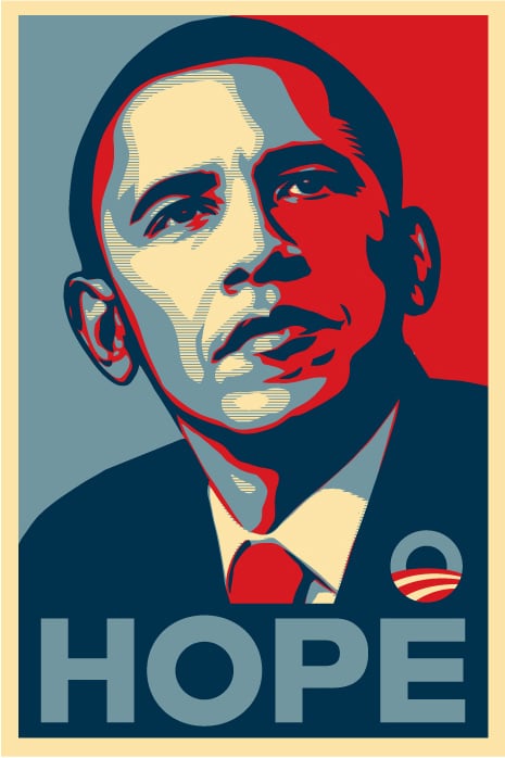
Gotham
"It has a powerful presence yet it is approachable and even friendly."


A series on 25 favorite typefaces, cross-posted from our sister site HILOBROW.
"It has a powerful presence yet it is approachable and even friendly."
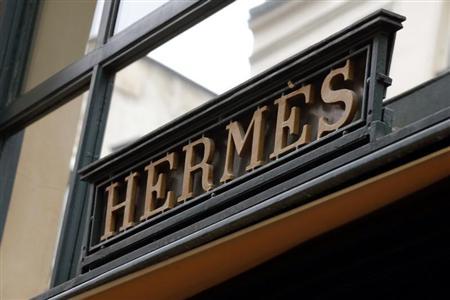
"In the most primitive part of our brains, we are all permitted to feel superior to anything written in Hotdog."
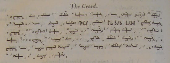
"Building each signifier out of a natural description of the thing it signifies."

"Comic Sans joins the ranks of Nickelback and Hot Pockets as a thing you’re only allowed to like in a so-bad-it’s-good way."
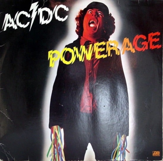
"It attacked the Establishment’s preferred information typography style with a sharp edge."
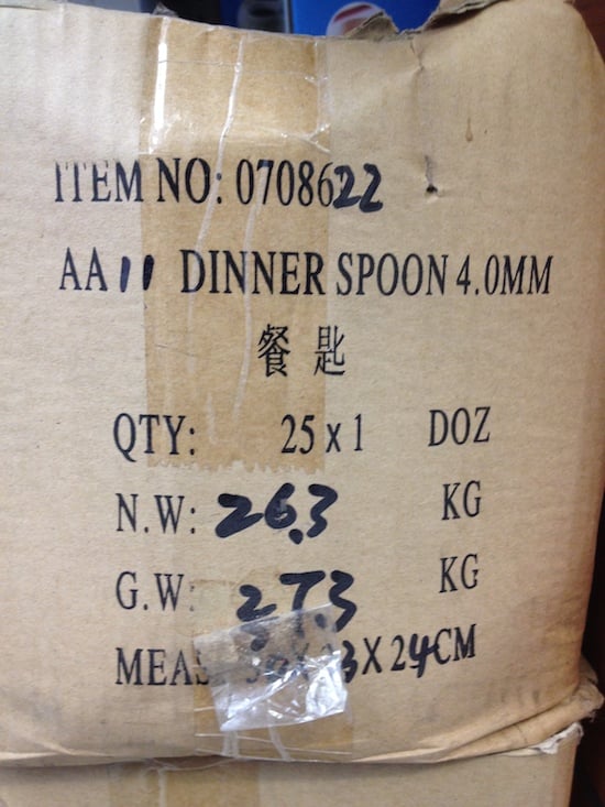
"For those of us who crave the off-version of your basic commercial reality, this is all just great."
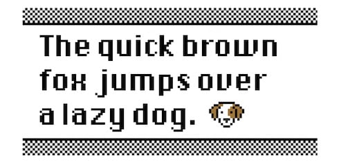
"The secret was in the spaces between the letters."
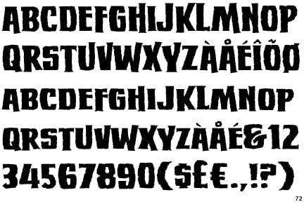
"Flexible enough to evoke both Ed 'Big Daddy' Roth and The Exorcist."
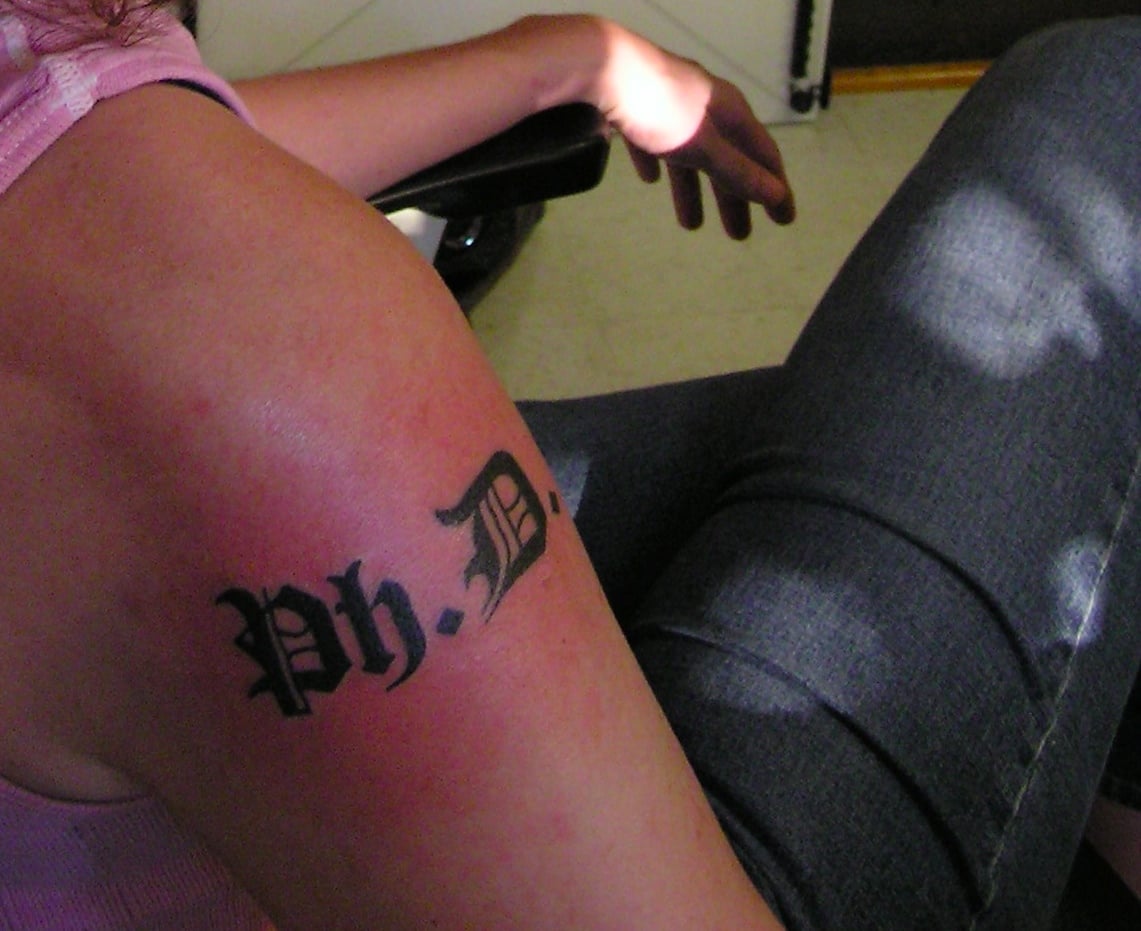
"My tattoo indelibly links me to a nine-hundred-year-old scholastic tradition of writing and reading."
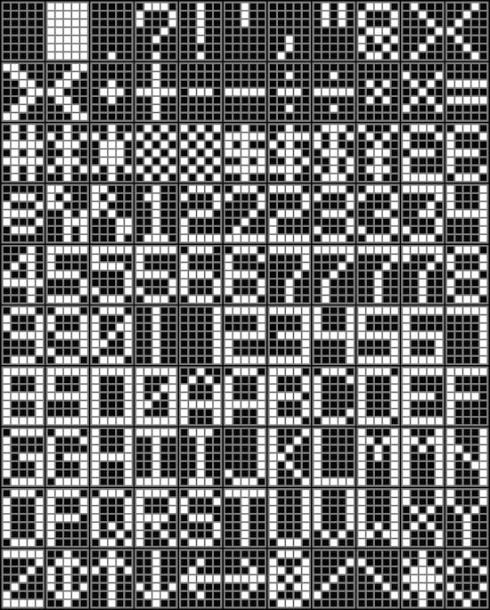
"Getting early electro-mechanical systems to dynamically display changeable text was a pain in the ass."
"The typography drives me crazy."
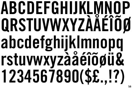
"Want to say something? Reach for Trade No. 20."
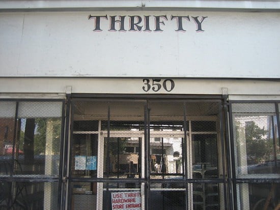
"He ought to be a celebrated figure, for contributing brilliantly to Savannah’s visual charisma."
"They were designing a means of expression intended to last a thousand years."