

Shatter
One in a series — cross-posted from our sister publication, HILOBROW — dedicated to 25 of our favorite typefaces.
SHATTER | VIC CARLESS | 1973
Shatter is a typeface designed by British commercial illustrator and designer Vic Carless in 1973: the year that the optimism of the Sixties died and was replaced by the darker, less optimistic mood of the Seventies.
Carless was a typical post-war Brit: sensible haircut, sensible shoes, always wearing a tie, probably working on his illustrations with a pipe clamped between his teeth. By the end of the Sixties he’d produced an impressive portfolio of paintings depicting affordable cars for the fleetingly buoyant British automotive industry, and many model-airplane box illustrations. His illustration style epitomises the vernacular of conservative post-war British marketing: muted, modest, conformist, idealistic.
So what happened in ’73? Did Carless start smoking something besides pipe tobacco? How did a man who had previously been the source of so many scenes of wholesome living suddenly break character and invent a cut-and-shut typeface that stuck its fingers up to clarity and order… in a manner that predated British punk by several years?
Shatter is not inherently punk in style, but its discordant nature — born from the subversion of (then) contemporary reprographic process — is undeniably punk in spirit. Shatter’s glitch-like mechanical aggression distinguishes it from its closest predecessor: B-Movie lettering, which is distinctly hand-painted and wilfully theatrical. Shatter differs too from psychedelic lettering, which is all about organic hyper-harmony and sensuous fluidity. Shatter came neither from the hand nor from transcendental sensuality but from cold, machine-induced paranoia. It attacked the Establishment’s preferred information typography style with a sharp edge and recomposed it in a jarring manner that still makes your eyes skitter and your brain tick trying to recompose it. Shatter literally sliced up Swiss modernist authority, and created an anti-Establishment statement from the shards.
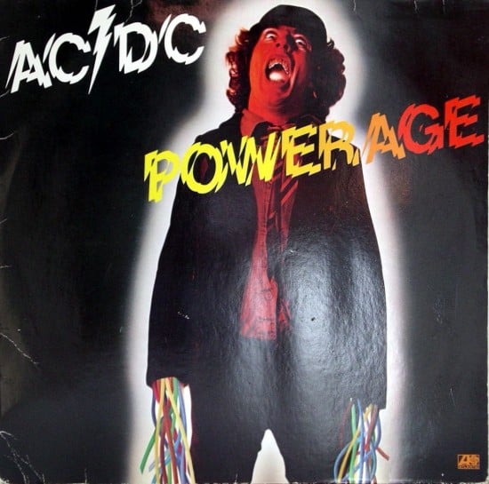
I learned early on that Shatter’s visual stutter makes it very difficult to space optically. Too close and it crashes and fights with itself; too spaced and it loses the ominous nature of a tight-knit, energised mob. It requires an extreme economy of words to be at its best, and it needs to show a brutal disregard for the elements around it. For this reason there are few examples of Shatter being used effectively. The best examples are single, potent words placed awkwardly, as though invading the graphic composition — as in the artwork for AC/DC’s Powerage album, where the title appears off-kilter, off-centre, and in every respect jarring with a relatively restrained artwork for the hard rock genre. Shatter is at its best when it appears to be deployed by people who really don’t care about the rules.
The basic energy of radical ideas is best expressed via a visual language system that knocks people from their comfort zones, presenting something so disconcertingly different that a perception shift occurs in the viewer. By cutting up the Establishment, Shatter brutally assaulted accepted norms, triggering a realisation that order and civility are participatory illusions of suppression and control. Shatter gave the designers of the Seventies permission to sample and subvert the Establishment.