

Wilkins’s Real Character
One in a series — cross-posted from our sister publication, HILOBROW — dedicated to 25 of our favorite typefaces.
WILKINS’S REAL CHARACTER | JOHN WILKINS | 1668
It was the 1660s in London, and philosophy needed fixing. In the wake of Francis Bacon’s “great instauration,” the Royal Society had begun a program to improve natural knowledge by grounding it in experiment and observation. But, pondered John Wilkins, what good were these experiments if one couldn’t precisely communicate their results to others? Spoken language is too slippery, and written language too inconsistent, with vowels and consonants “promiscuously huddled together.” To advance knowledge, science needed an equally advanced system of communication — one in which the babble of words dissolves into the material certainty of things.
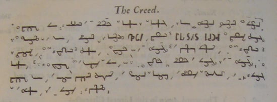
In his Essay Toward a Real Character and a Philosophical Language (1668), Wilkins designs this system. He begins by enumerating the entire known universe, hierarchically subdividing all things according to a binary system of difference. For instance, a “tiger” is a viviparous (rather than oviparous), cloven-footed (rather than whole-footed), rapacious cat-kind beast, with shorter legs but a larger body than other cats, characterized by its spots. Each of these distinguishing traits then forms the basis for a particular mark or diacritic within the signifying ideograph, the “real character.” Anyone who knows the system could, in theory, decode a given character’s meaning — decode its place in the world’s natural hierarchy — regardless of his mother tongue. Thus Wilkins fixes and universalizes scientific communication by tethering orthography to ontology, building each signifier out of a natural description of the thing it signifies.
To cut the type, Wilkins enlisted Joseph Moxon, a hydrographer and printer who would later pen a Vitruvian treatise on the beauty of letterforms. The resulting characters dance like stick figures across the walls of a fire-lit cave. While they aren’t beautiful, exactly, there’s something pleasingly kinetic, even mystical in their permutations. Angles, lines, and curls merge, disassemble, then recombine in a cabalistic ballet of symbols, each new combination signaling a shuffle in the fundamental matter of reality. The idea of a divinely perfect Adamic language enamored Wilkins, as it did many of his contemporaries; to recover this prelapsarian system of communication would be to rediscover the natural order of the universe, to read the Book of Nature with godly eyes, solving the mysteries of science.
Perusing Moxon’s type today, I don’t find Adam in the Garden of Eden but a grotesque admixture of semi-Hebraic marks and proofing symbols, rooted in Restoration-era beliefs about print, science, and the mysteries of nature. As ideographs, Wilkins’ failed characters ironically signify the limits of their human maker, drawing attention to their own historical contingency — which is, of course, precisely why they continue to captivate us.