Diploma Regular
One in a series — cross-posted from our sister publication, HILOBROW — dedicated to 25 of our favorite typefaces.
DIPLOMA REGULAR | DESIGNER: UNKNOWN | 1993 (DERIVED FROM 12TH-CENTURY BLACKLETTER)
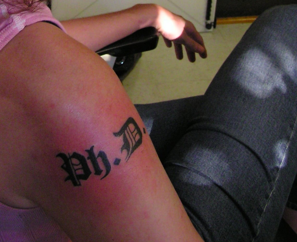
In 2004, a few days after I successfully defended my University of Virginia Ph.D. dissertation in English Language and Literature, I arranged a trip to a tattoo parlor in Charlottesville to mark the occasion appropriately. I found the typeface I wanted for free online. It can still be found on sites such as Fonts2U.com (and is not to be confused with a similarly named typeface by a Toronto design firm). Using Microsoft Word 97, I generated a document containing two different sizes of “Ph.D.” in Diploma Regular — one in 96 points and one in 84 points — since I wasn’t sure which size would fit best on my shoulder. At Acme Tattoo, I handed the printout to the artist, and he began his careful corporeal calligraphy.
It surprises me that some people get textual tattoos without specifying the typeface. A friend of mine had “Not all who wander are lost” tattooed on her shoulder blade and let the artist do whatever he wanted: amazing. Even Shelley Jackson, whose 2095-word story “Skin” began in 2003 to be tattooed word by word on the bodies of willing participants, didn’t specify a typeface, merely stipulating that “Tattoos must be in black ink and a classic book font.”
In a sense, blackletter typefaces like Diploma Regular are some of the most classic book fonts of all time: the first typefaces used by Gutenberg and Caxton were blackletter skeuomorphs that imitated monkish script. But both handwritten and typeset blackletter were hard to read and hard on the ink supply, so in the early fifteenth century the type of script known as “humanist minuscule” was developed to replace the barbaric Gothic of blackletter with a purer classical form. Such “Roman” scripts would ultimately be models for Roman typefaces. Most European countries adopted Roman type as their default at the end of the sixteenth century, but German scholarly and literary texts were printed in blackletter for centuries thereafter — at least until a 1941 Nazi edict banned its use in publishing, although some Nazi stationery remained in blackletter.
I knew little of that history when I chose Diploma Regular for my tattoo. I chose it because universities use blackletter for their diplomas, and have done so for centuries. My tattoo, and the degree it represents, indelibly links me in indelible ink to a nine-hundred-year-old scholastic tradition of writing and reading. Diploma Regular and its many “Gothic” or “German blackletter” or (inaccurately) “Old English” cousins strongly suggest antiquity and authority and pomp and rigidity, and for that very reason they suggest defiant misbehavior when deliberately used incongruously, as in the logo of The Pirate Bay or in heavy metal logos. I am not nearly as defiantly mischievous as that, but my tattoo in Diploma Regular is a joke that everyone gets. My “Ph.D.” hurt a little, but it needn’t always be taken seriously.
Photograph by Devon Sproule, 2004.