

Trade Gothic Bold Condensed No. 20
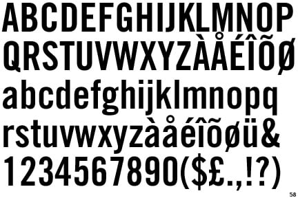
One in a series — cross-posted from our sister publication, HILOBROW — dedicated to 25 of our favorite typefaces.
TRADE GOTHIC BOLD CONDENSED NO. 20 | JACKSON BURKE | 1948–1960
Every designer has their go-to typeface. When the deadline is looming and there’s no time to meddle with font searches or type studies, my go-to is Trade Gothic Bold Condensed No. 20. I use it less frequently than I used to, these days, but it still makes an appearance during the type study phase of most projects. Like a trusted friend, No. 20 will always be there to help carry the day.
The sans serif typeface Trade Gothic was designed in 1948 by Jackson Burke, who continued to work on it for years. Not as rigidly refined as later (1950s) counterparts like Univers and Helvetica, Trade is slightly more human. Not that it’s a “humanist” face by any means, but it has a bit of wabi-sabi to it. Trade is airy in its spacing — especially when set as text — which gives it its pleasing character. Of all the weights and styles of Trade, Bold Condensed No. 20 is Burke’s crowning achievement. My assistant Matt says that Trade Gothic Bold Condensed No. 20 is “unbiased and honest.” It’s one of his favorites too — that’s one of the reasons he’s working with me.
You might say that Helvetica is unbiased, too. But that face’s overuse, by everyone from Crate & Barrel to Target to Vignelli’s National Parks maps, has revealed a certain characterlessness; Helvetica lacks transformative power. Trade No. 20 is unbiased in the sense that it has the ability to transform set text not just into information, but into statements. It’s a typeface for heroes and wise-asses alike. It plays well with others — that is, it combines nicely with more extravagant or decadent faces and can serve as a workhorse option with other sans serifs. Its versatility is wide ranging: I’ve used it in a cookbook by Melissa Gray (All Cakes Considered); a colleague has used it in an elegant catalog for an art exhibit about war stories; and on Charles Street here in Boston you can see a couple of broadsides three stories tall commemorating fallen firefighters — they’re set in Trade No. 20, too. Have I mentioned that Trade No. 20 works best real big, set in all caps?
Need to advertise the latest and greatest sofa? Go for Helvetica. Want to say something? Reach for Trade No. 20.