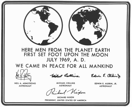
Futura
"Futura represents the rational utopia of progress, where everything not only works well, but looks good doing it."


A series on 25 favorite typefaces, cross-posted from our sister site HILOBROW.
"Futura represents the rational utopia of progress, where everything not only works well, but looks good doing it."

"The US is country of immigrants, which means that we are awash in repurposed culture, little of which is seen as appropriation."
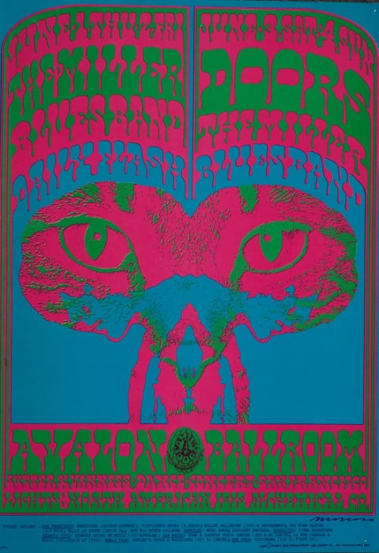
"Moscoso’s genius was to give sculptural form to the negative space between his letter forms…"
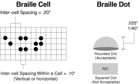
"Typefaces read with the hands can be just as complicated as those read with the eyes."
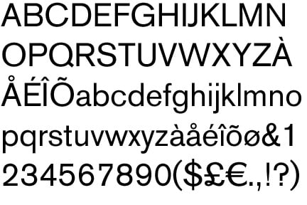
"A stark, proto-Brutalist typeface totally out of step with the times, it was a revelation."
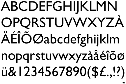
"Gill Sans is, in effect, the national typeface of England."
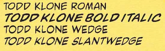
"One of the classic American comics letterform sets."
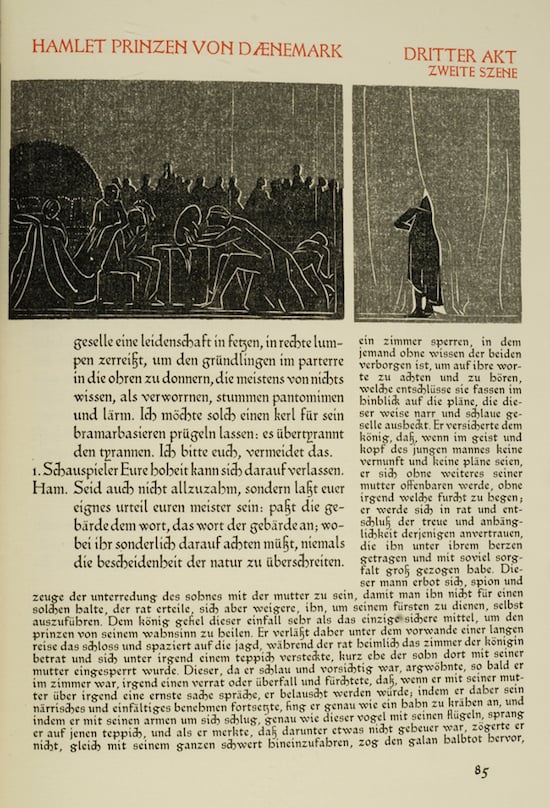
"A book that is of both the past and the present."

"The Toronto subway opened in 1954, and the original stations used a unique typeface…"
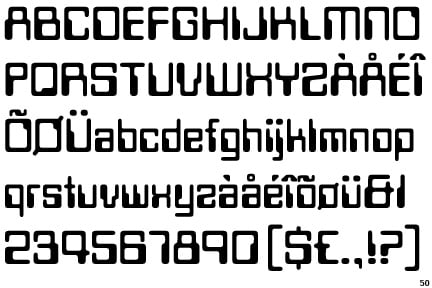
"The fanciful logo of a tomorrow that would always feel far off."

"Its oblique flow captured not only the letter of Renaissance humanism, but its spirit as well."