Chinese Shipping Box
One in a series — cross-posted from our sister publication, HILOBROW — dedicated to 25 of our favorite typefaces.
CHINESE SHIPPING BOX
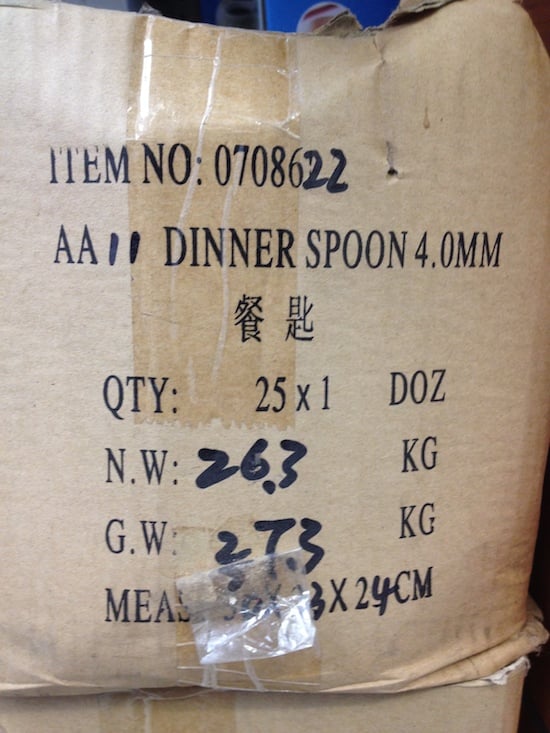
For years (and years!) I’ve been charmed and puzzled by the off typefaces printed on the cardboard shipping boxes of cheap Chinese imports. The kind of boxes held together with those giant staples; the boxes you knew had no Apple computer in them. The type looked, in its infinite variation, so close, but just not recognizable as any typeface I could identify. It was uncannily, entrancingly, wrong. But it did clearly epitomize the products it was linked to, as much as an Apple computer box did.
The serif fonts, the creepiest, seemed to be a hillbilly relative of Times Roman, arguably the most generic, charmless, widely available, font to hack if one was so inclined. And they were, of course, condensed and expanded — like a multi-generation photocopy, its origin a blur. All leading, tracking, and spacing considerations were thrown to the wind.
For those of us who crave the off-version of your basic commercial reality, this is all just great. This is generic, non-branding at its finest. Nothing to remember here for the next time. Just move along.
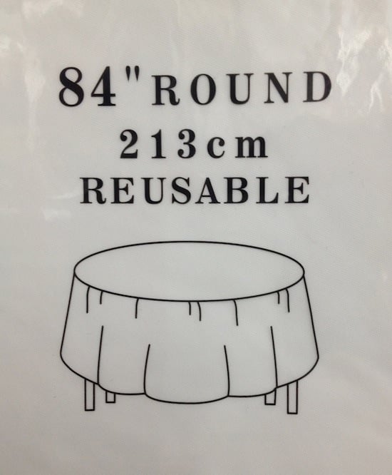
In fact, these typefaces, the feeling of them, have become a font, a huge font family — Chinese Shipping Box — in the way that a weed can eventually get to be called a flower. Maybe I’m late to the party and this is actually the source of the slurry of purposely uncomfortable typography making the rounds. It does have a kind of “Fuck you! What are you looking at? What’s your problem?” swagger. Though sometimes, as in 84″ Reusable [see below], it can feel clean and fresh, like leaving the city.
Compared to all this, good typography glows shiny and new… and not in a good way.