

Hermès vs. Hotdog
One in a series — cross-posted from our sister publication, HILOBROW — dedicated to 25 of our favorite typefaces.
HERMÈS vs. HOTDOG
“Sign becomes the arena of the class struggle.” — Volosinov (1973)
Long before the black arts of advertising dominated and deformed human consciousness via the media, the eternal war between the ruling class and everyone else articulated itself in the arena of sign with the foundation of luxury brands.
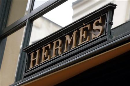
The Hermès brand, established by Thierry Hermès in 1837, was recognized by the aristocracy for its quality equestrian harnesses and bridles. By 1915 it had branched out into luxury saddles. Today, the Hermès luxury brand, known for its loud scarves and leather lifestyle accessories, has its own mystique of entrenched, untouchable wealth.
Since our society has become steeped in commercialization, brand logo typefaces, like fashion statements, have become a language of references that immediately register vast amounts of information to the viewer, at the speed of synapse-connection. The power of branding to confer or deny status has now extended to typefaces in and of themselves. At this point, a typeface may so completely telegraph the perceptual value of the signified object that the object itself is arguably no longer required as measurable proof of its own value.
The current Hermès logo, in use since the 1950s, is a modified form of the typeface Memphis, designed by Dr. Rudolf Wolf in 1929. The logo, in all caps, with its broad and overlong slab-serifs, suggests a surplus of elegance — and the time, means, and cavalier attitude to cultivate it. The Hermès iteration of the Memphis typeface has “Fuck You” kerning, designed to evoke the privileges, status and authority of “Fuck You” wealth.
The Hermès logo evokes the institutional power to enslave, discipline, terrorize and punish. Its typeface does not merely amplify feelings of economic prestige among the wealthy (which are open to be interpreted as superiority above and beyond the economic — i.e., personal, racial, genetic) — it also has the power to produce converse feelings of amplified inferiority among the poor (also welcome to be misinterpreted as racial, personal and/or genetic).
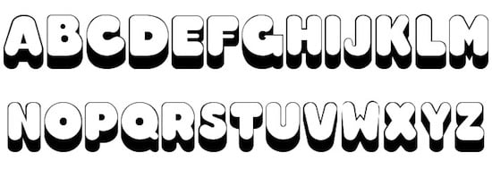
Conversely, there is no authority whatsoever permitted by the bulbous lettering of the Hotdog typeface. In the most primitive part of our brains, we are all permitted to feel superior to anything written in Hotdog. This is arguably its function.
The tubular letters, which look as if they were shat out of an industrial asshole in an unkosher frankfurter production-line, telegraphs to the eye a unifying come-as-you-are vulgarity. It is a bathrobe-casual, obese, flatulent Everyman of a typeface, evocative of aluminum deck-chairs, Coors tall-boys, primary-colored plastics, carnival nausea, and profane, brutalist dick-cartoons scrawled next to the faces of toothy television actresses on subway posters.
Fontwise, Hermès, in its fragrant calfskin jackboots, is a bright smack across the eyeballs with a $3500 riding crop. It shits on Hotdog from the towering height of its authoritarian, bronze warhorse. Hermès enslaves Hotdog, and, finding its labor to be of less value than its incarceration, ultimately solves the problem of Hotdog’s existence — its blight upon the aesthetic landscape — by imprisoning it.
Hotdog is already nearing extinction. Hermès, on the other hand, is arguably just getting started.