Scream Queen
One in a series — cross-posted from our sister publication, HILOBROW — dedicated to 25 of our favorite typefaces.
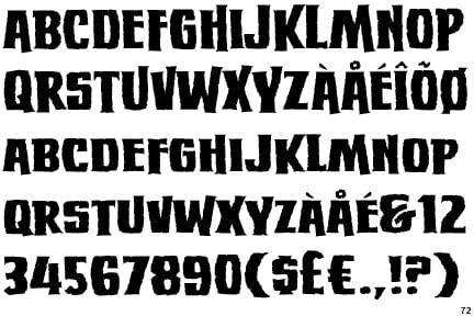
SCREAM QUEEN | NATE PIEKOS | 2008
I’m in love with a Scream Queen. No, it’s not Janet, Jaime Lee, or Linnea. My beloved Scream Queen isn’t a member of the pantheon of sonic screen sirens of whom you may have heard (albeit with pierced eardrums). My Scream Queen has no face; she is a face.
It was a dark and stormy night — or perhaps I only remember it that way. Having been challenged by Adam McGovern, budding auteur of print, stage, and computer screen, to design an appropriate logo for his slightly satanic superheroic horror comic, Nightworld, I was stalked by the spectre of surrender. I had found nothing suitable in my stuffy stable of sans-serifs that could recall the British Hammer Films posters whose gory, garish glory Adam had sought to emulate. I began to panic as I careened down the blind back alleys of internet fontdom. I didn’t belong here. I had come to the world of digital lettering through the back door, a sign writer devoured by technology’s merciless, mutating maw. Cold dread built in my chest until I could contain it no longer! That’s when I saw her: Scream Queen.
She was a jagged lightning bolt given form. (Two forms, actually: Regular and Thin, with italics and — as if in deference to the aforementioned Hammer Studios — European characters included.) The brainchild of Blambot’s digital lettering mogul/wunderkind, Nate Piekos, my love is a Screaming Mimi Van Doren of a typeface, with an ambitious array of angles instead of a coquettish collection of curves. She may have “small caps” in lieu of a true lower case, but as is true of any good comic book or sign font, a lower case can be finessed without being obvious, and the small caps contrast with the upper case perfectly. And speaking of contrast, no typeface wears a drop shadow better than the Scream Queen does.
Sure, her topline and baseline can be a little unruly, and delightful descenders can appear out of nowhere, but that’s the price of all that potential for passionate expression. Scream Queen is flexible enough to evoke both Ed “Big Daddy” Roth and The Exorcist, and this duality made her not only a perfect starting point for the Nightworld logo but for various titles and package accents as well. From my perspective, the typeface has become a supporting character.
I always was a sucker for a woman of letters.