Kumon Worksheet
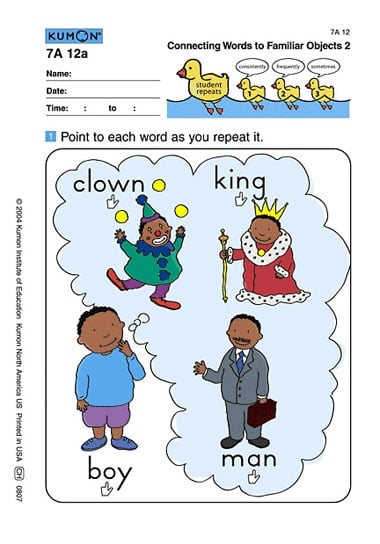
Image courtesy of CA
One in a series — cross-posted from our sister publication, HILOBROW — dedicated to 25 of our favorite typefaces.
KUMON WORKSHEET | UNKNOWN | c. 1970s?
When my son was 3 he was kinda bilingual — more fluent in Japanese than English — because we speak Japanese at home, and because his English-speaking friends moved away to a more “family-friendly” neighborhood. Three months before he was to enter Pre-Kindergarten, my son made an announcement that he no longer wished to play with non-Japanese-speaking friends. So I immediately took him to a Kumon learning center located four blocks from our apartment.
I had modest ambitions. All I wanted was for my son to gain a little confidence in English before entering school. But after meeting with the instructor for parent orientation — at which she served up a smorgasbord of success stories and encouragement — I started to fantasize that my son would be reading the Frog and Toad books on his own before entering Kindergarten.
He started from the very bottom level, which works like this: Two times a week the student attends the learning center. The instructor points to a word on a worksheet and reads it aloud; then the student repeats the word and pointing. There’s also homework: a booklet of 20 worksheets a day where I, the parent, point and read in place of the instructor. The worksheet is the heart and soul of Kumon learning. Kumon says that the worksheets have been carefully studied and “designed” by experts. Mr. Toru Kumon himself was a father, a high school math teacher who created worksheets for his son who was failing math in school. The worksheets were made by a real parent. What’s not to like?
The homework was new and fun for both of us, at first. But after a couple of weeks I was increasingly annoyed. Not because my son was busy doing all sorts of damn cute things — like making a long nose with his arm when he recognized the word “elephant” — instead of repeating the words. I was annoyed because I hated the Kumon worksheets. Specifically, the typography drives me crazy. I’m disgusted by the faux Futura — and the kerning is unforgivable. As far as ligature goes, it’s nonexistent.
What was more disturbing was that after eight weeks my son was getting it. He was starting to read. A sane parent would be happy at this point, but all I felt was guilt. I was making him read words that one of his toy trucks can drive through, literally. So I made him quit. It’s madness, I know. He’s maybe the only child in the world to drop out of Kumon because Mommy felt that their worksheet, despite its effectiveness, goes against her typography values.
A year later, my son plays with his classmates in whatever language they speak. He can read and spell some simple words. (“Fat! f-a-t fat!”) He likes to borrow books from school; his current favorite is My Mouth is A Volcano. Now if only he could remember to write his name from left to right…