She’s Not There
One in a series — cross-posted from our sister publication, HILOBROW — dedicated to 25 of our favorite typefaces.
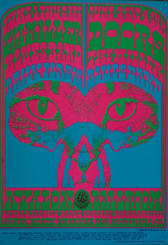
SHE’S NOT THERE | VICTOR MOSCOSO | c. 1964
Along with long hair, rock music, and light shows, the year 1964 (the first year of the cultural era we know as the Sixties) saw an explosion of hippie posters. Confusing to the eye and impenetrable to the square, hippie posters were tickets to a world-wide underground trip. The posters shared common elements — Art Deco, Art Nouveau, and Pop Art influences; old photos and other Twenties nostalgia; elements lifted from vintage comics and package design — all subject to drifting distortion and vibrating colors. The nexus of these graphic experiments was San Francisco, where, for example, Wes Wilson adapted a wavy typeface designed in the early 20th century — by Viennese Secessionist Alfred Roller — for Bill Graham-era Fillmore posters. Wilson’s fellow poster designer, Victor Moscoso, who’d studied at Cooper Union and Yale, brought a sophisticated design sense to San Francisco when he moved there from his native New York in 1959… and he misused what he’d been taught in the name of revolutionary eye-punching. Moscoso’s genius was to give sculptural form to the negative space between his letter forms — and to pose those shapes (in throbbing candy colors) on receding psychedelic palm- and pyramid-strewn landscapes. This was an exceedingly hard-to-read effect, but if you got it… and saw the words standing in-between the lines… in the negative zone… where they were not… it was FAR FREAKIN’ OUT. As far as I know Moscoso’s type approach has not been named, so I call it She’s Not There.