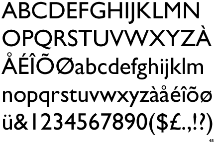
Gill Sans
One in a series — cross-posted from our sister publication, HILOBROW — dedicated to 25 of our favorite typefaces.
GILL SANS | ERIC GILL | 1926
It is possible that Gill Sans is not the most beautiful typeface to sprout from the fertile mind of Eric Gill (1882–1940), towering genius of letterform, also unrepentant adulterer and devotee of both incest and bestiality. I came across Gill’s serif work first, in a modern reproduction of his Essay on Typography, which Gill had originally hand-set in the arguably prettier Joanna, a face inspired by the work of Robert Granjon (1513–89) and named for Gill’s perhaps too-beloved daughter.
The Essay, a combination of practical primer, polemic, and tendentious lifestyle manifesto, was written while Gill was recuperating in hospital from a bout of nervous exhaustion (Joanna was about to get married). The book ends with a ‘utopian’ scheme to rid the world of the very art that made its author’s career possible: “Lettering has had its day. Spelling, philology, and all such pedantries have no place in our world. The only way to reform modern lettering is to abolish it.”
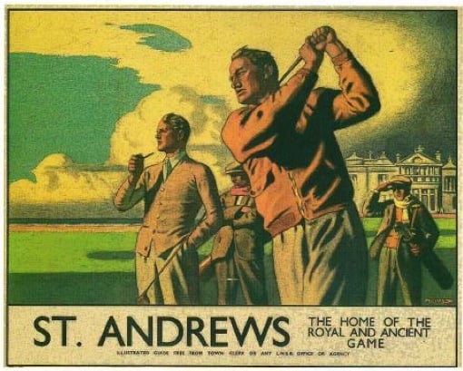
Joanna is not really a suitable typeface for large blocks of text: especially if closely kerned, its stern right-angle serifs grow punishing. The slight Italic, just three degrees off vertical, conveys an almost accusatory mien, as if leaning away from full assent to the words. Gill Sans was born as a display face: Gill cut the first forms in 1926 to decorate the facade of friend Douglas Cleverdon’s Bristol bookshop. He later developed it for Stanley Morison of the Monotype Corporation, and the design enjoyed a breakout success when used, during the 1930s, as the signature typeface for the London and Northern England Railway’s series of gorgeous tourism posters. From the first, there had been an association with rail travel: Gill’s design was derivative of Edward Johnston’s London Underground typeface (officially known as Johnston), and the influence of both can be seen in, among others, the Toronto Subway Font.
Gill Sans has since thrived as a reliable humanist sans serif type for both text and display. Its debts to Caslon and Baskerville are obvious without being patronizing, and the deep soil of the Carolingian script supports the roots of its elegant lower-case elements. It can be bolded to excellent effect, growing fat without risking distortion, as in the logo of the British Broadcasting Corporation. Penguin Books and British Rail used it, though the latter eventually succumbed to Univers and the ubiquitous Helvetica. The adoption of Gill Sans by both the Church of England and the British Government render Gill Sans, in effect, the national typeface of England.
Several years ago, I was accepted as a ‘word’ in artist Shelley Jackson’s Skin project, a diachronic novel written entirely in tattoos on the bodies of willing volunteers, who are known as Words. My own delivered word was ‘page.’, complete with the full stop. I had it done in Gill Sans bold, on my right shoulder, and now that round full stop takes its place in a little constellation of moles. Page, period.