Johnston’s “Hamlet”
One in a series — cross-posted from our sister publication, HILOBROW — dedicated to 25 of our favorite typefaces.
JOHNSTON’S “HAMLET” | EDWARD JOHNSTON | 1929
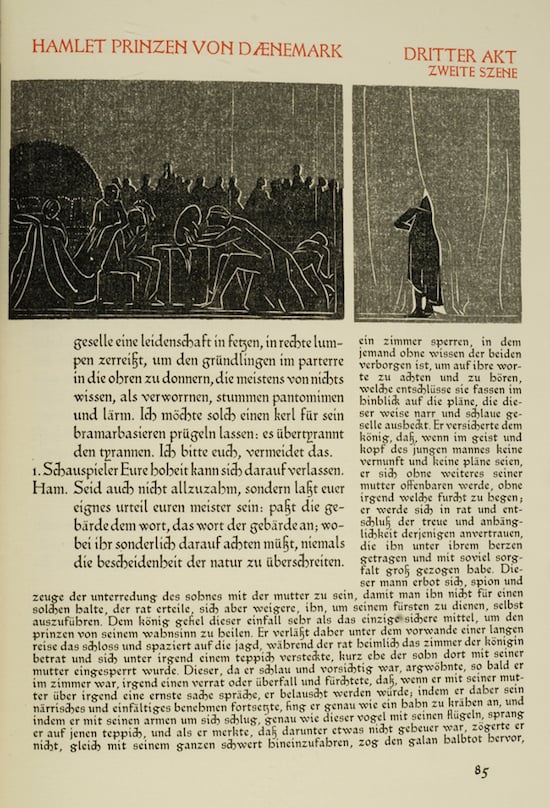
If you wanted to model a book after the earliest printed books, you might mirror their layout — placing the main text in the middle of the opening, with commentary surrounding it along the margins and illustrations interspersed. You might commission one of the great artists of your age to cut new woodcuts and choose a text that is itself centuries old but still loved today. And you might find a typeface to do the same, straddling the past and the present.
When Henry Graf Kessler wanted to print an edition of Hamlet, he did all of these things. The most striking part of the 1929 book is its illustrations — Edward Gordan Craig’s images are stunning and powerful. But what ties the Cranach Press Hamlet most clearly to Kessler’s vision of reworking the past is Edward Johnston’s type.
Johnston’s typefaces for the London Underground are decidedly modern sans-serifs. But for Hamlet, at Kessler’s direction, he turned back to some of the earliest fonts, the blackletter types designed by Peter Schoeffer. (The colophon for Hamlet states that the typeface derives from the 1457 Mainz Psalter, but L.M. Newman’s collection of Kessler’s and Craig’s correspondence describes the 1462 Bible and 1472 Decretum as being additional key texts for Johnston’s inspiration.) Schoeffer’s typefaces, like other early fonts, have their origins in scribal writing. Imagine writing with a thick quill, and you might — if you were very talented — come up with the blocky blackletter of medieval religious books. As Schoeffer continued to adapt those letters for the system of punches and matrices that produce metal letters, however, he opened up the white spaces, giving a whole different look to the page. This might have been an aesthetic choice, but it was certainly also a practical one: by introducing more space between the letters, Schoeffer reduced the number of ligatures and the pieces of type that needed to be cast.
Just as Schoeffer took the letters of earlier scribes and adjusted them, so Johnston took Schoeffer’s typeface and reworked it for a twentieth-century audience. In Johnston’s hands, the fussiness of the earlier letters is minimized, but if you compare the type of Schoeffer’s 1472 Decretum with Johnston’s 1929 Hamlet, you’ll see the resemblance clearly. Johnston’s ascenders tend to stand straight up, but the curves in the “h” and “g” come straight out of Schoeffer’s. The 12-point type used for the Hamlet commentary is a mixture of sans serif and serif, letting in more air while still suggesting the heaviness of blackletter.
But that’s what you see when you look with a knowledgeable eye. What do you see when you look at the book with your heart? What I see is a book that is of both the past and the present, a book that looks back to foundational moments of printing, illustration, and drama and makes them speak to the world even now, nearly a century after its production.