Toronto Subway
One in a series — cross-posted from our sister publication, HILOBROW — dedicated to 25 of our favorite typefaces.
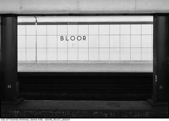
TORONTO SUBWAY | UNKNOWN | c. 1954
The first time I visited Toronto as an adult, I nearly swooned on a subway ride — I’d never had such a visceral response to typography before.
The Toronto subway opened in 1954, and the original stations used a unique typeface: a geometric sans serif that included only upper-case letters, ten numerals, an ampersand, period, apostrophe, and an arrow. As Joe Clark relays in his history of Toronto transit signage and typography, the original font has a few distinguishing features:
- Near-perfect circles for C, G, O, and Q.
- Similarity of upper and lower bowls of B.
- Near symmetry of E and F along a horizontal midline.
- An X that looks like a multiplication sign (clearly an incorrect form).
- A Futura-like S made of two hooks.
- Strokes that tend toward straight lines (even the stem of the distinctive low-waist R) and terminate at right angles.
- Spiky corners on M, N, V, and W that descend below the baseline or project above the cap height.
Toronto Subway has some similarities to, among other typefaces, Gill Sans — which has been used, at times, on signage throughout the Toronto system. In fact, in the 1990s, when the Toronto Transit Commission hired eminent Canadian designer Paul Arthur to revise the entire signage system, he proposed replacing the original typeface — and all the variations used since — with Gill Sans. Thankfully, this change was never made. Despite the TTC’s lack of attention to its own typography, the original Toronto Subway typeface has not gone unnoticed. Histories like Clark’s have been written, Jose Ongpin created dense typographic history illustrations, Spacing magazine created a popular set of buttons and magnets, and typographer David Vereschagin created an electronic version — not without some controversy.
Toronto’s original 1954 stations display a consistent, tactile materiality. Their aesthetic has been repeatedly described as “Canadian washroom,” because tile (referred to as “Vitrolite” in Clark’s history) dominates. The station names were sandblasted into wall tiles, across the borders between the tiles. The names were painted a contrasting color to the tile color, creating an effect that Clark calls “subtly three-dimensional,” and which he says “gives a feeling of permanence.” The original directional signage used the same typeface and employed white characters on black steel (both enameled and not) and backlit plastic signs. In the 1950s and 1960s, occasional directional signboards also appeared with painted-on type, which — according to archival photos — appear to have reversed the colors (to black on white). These materials were mostly, although not consistently, kept in use throughout the expansion of the subway system.
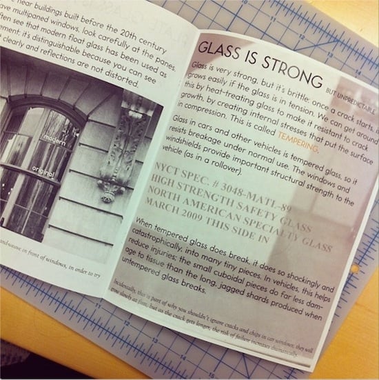
My favorite use of the electronic version of Toronto Subway is in a zine series called Material Evidence, created by Toronto native, engineer, professor, materials scientist, and HiLobrow contributor Deb Chachra. Appropriate for the makeup of the tiles upon which this typeface was originally used, the first issue of Material Evidence concentrated on glass.
The designer of the Toronto Subway font has never been identified.