Data 70
One in a series — cross-posted from our sister publication, HILOBROW — dedicated to 25 of our favorite typefaces.
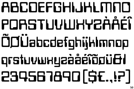
DATA 70 | BOB NEWMAN | 1970
Typefaces’ style lends a subtext to this most literal form of text, and the swelling boxy curves and slim verticals of Data 70 were meant to make you think of a physicality contained in the oncoming ephemerality of computer culture. They derived from the dashes and squares of punchcard-reading machinery, and thus gave a material distinction to the letter-formation that still relied on solid processes, even though the brawny mechanisms involved were the thing we had previously feared would replace what we humans had to offer. The industrial revolution might have made our muscles redundant, and the thinking machine might do the same for our minds — so it was reassuring to imagine that even a robot-brain overlord would at least need someone living to attend it.
Hence the streamlined tabs of Data 70, like chic, TV-screen-cornered descendants of the blobs of ink and quill. The stepped contours of its letters were slightly more aerodynamic heirs to the stiff human figures of archetypal Egyptian hieroglyphics. In this way the font peopled its sentences and humanized its templates. It was also declaratively unnecessary; the implicit adornment of its off-center spaces and popped-out flares was surplus to the kinds of functional fonts by which machines, both literal and social, have communicated with themselves — military stenciling, austere teletype readouts. Ornament suggests choice, and leisure, and spare time for unscheduled dreaming; the pleasing present we still wanted to live in. Data 70, after all, overtook the now, not the next — it was ubiquitous in the 1970s as a signifier for what was modern. But even then we knew the real future wasn’t likely to look that way.
The font’s embellishments proceeded directly from the flourishes of 1960s psychedelic lettering, that progression a contract with the idea of an unbroken succession of period-defining aesthetics, Data 70 being a graffiti-tag of the utopian outer-spaciness that complemented drug-culture’s arcadian inward psychological journeys. (True to the hippie ethic it also of course apparently popularized, repurposed and beautified the MICR — Magnetic Ink Character Recognition — typeface seen on bank checks from the 1950s to this day; a functional 14-character Newspeak to Data 70’s flowing sci-fi soliloquies.)
Futura, a font that is suddenly everywhere you look in the 2010s, is future-y; a reboot of stylish but antiseptic deco-era systems of expression, with its fulsome but unwavering curves and akimbo angles — assured, machined, but the kind of thing you imagine labeling the future, not composing it (as the trippy sculpted shapes of Data 70 seem to do). And OCR A Standard is more than just a standard; it’s pervasive, and sometimes in the sinister connotations of that term — martial, functional, it’s the visual language of every drone and surveillance-camera spy-drama, seen mostly through veils of computer screens, the readout in some cyborg’s eye, the warning-sign on an era of dangerous activity and immaterial messages you can’t prove you saw.
The future, by definition, is something we’re not ready for, and this gets truer the more our technology lets it speed up to meet us. Data 70 was the fanciful logo of a tomorrow that would always feel far off, and that we were happy to wait for.