Quick Fix

Example provided by Sónia Marques (Portugal)
This is the first in a series of 16 posts offering an analysis of “Covid Codes” from a global perspective. SEMIOVOX has invited consulting semioticians from around the world to augment the Coronavirus-related meaning map whose lineaments we revealed here in a Spring 2020 series. We are grateful to our talented and generous colleagues, who are individually acknowledged in each series post that features their contributions.
The theme we’ll explore in this installment is: QUICK FIX. Our definition of this theme: Rapid relief of symptoms, for people too busy to slow down.
Of course, there is currently no OTC cure for Covid-19 readily available at the supermarket or pharmacy. (When we first started this study, there wasn’t even a vaccine. Thank goodness that has changed.) Because Covid-19 is an upper respiratory illness, this series will also examine themes activated against by Cough/Cold/Flu brands, as well as Allergy brands.
Brands, PSAs, and others activating against the Quick Fix theme intend to communicate the idea that relief from symptoms is readily available. The functional benefit, here, is “rapid relief”; while the emotional benefit is “relief from the stress that comes with having your busy work/life derailed.”
Brands playing in this space position themselves as part-doctor, and part-pharmacist. Like a doctor, the brand promises maximum effectiveness, medical and/or pharmaceutical expertise, authoritative knowledge. Like a pharmacist, the brand offers convenience, ease, on-the-go customer service.
PS: It was illuminating for me (an American) to discuss this topic with colleagues in other parts of the world — Italy and France, for example — where work is not considered more critical than one’s wellbeing. Rapid symptom relief, sure, we’ll find that need everywhere; but the idea that people can’t miss a single day of work… this is not a universal notion.
Our study suggests that the Quick Fix thematic space is brought to life for consumers by at least three “source codes” (signs). We’ve named these source codes: Dynamic Action, Misery Relief, and Emergency Response.
Dynamic Action
The Dynamic Action source code’s norm (that is to say, its idea, value, higher-order benefit) can be described as follows: Our dynamic product form will transform your day with the rapidity of a snap, burst, or squirt.

Visual cues of Dynamic Action include:
- Pills and tablets fizzing, bubbling, dissolving, bursting — releasing their cough/cold/flu (or allergy) symptom-relieving benefits
- Pills and tablets shown swirling around, suggesting dynamic energy released by the product
- Tablet, pill, or pack glowing with dynamic energy — or a person who’s used the product shown glowing.
- Grey, gloomy scene turning bright and colorful
- Note the frequent use of blue, here, particularly combined with no-nonsense, all-caps typography — which often signifies “medical.”
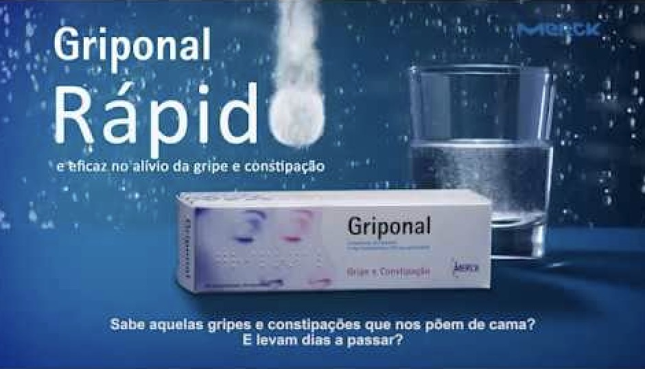
Sónia Marques (Portugal) shares a far-out example [above] of this sort of thing.
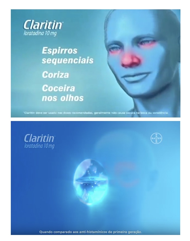
Mariane Cara (Brazil), writes about the example above: “The power of Claritin’s pill is almost magic (as in a fairy tale), bringing serenity and tranquility.”
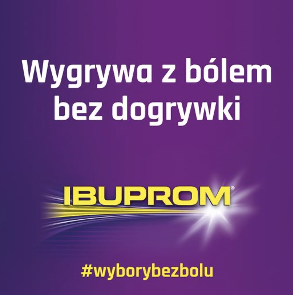
Maciej Biedziński (Poland) sends in an example [above] of a pain-relief brand communication that uses a sports metaphor to suggest rapid relief: “Wins against pain without [going into] overtime.”
Verbal cues of Dynamic Action include:
- Dynamic tonality related to product: “Powerful antioxidants,” “effervescent”, “Powerful immune boost”, “Get the immune support that gives you more”
- Dynamic tonality related to user: “Own the day.”

We have also included Household Cleaning products in our study, as this category is critically important to understanding the Covid “semiosphere.” Dynamic Action cues are also prevalent in this category. See below.
Misery Relief
The Misery Relief source code’s norm (that is to say, its idea, value, higher-order benefit) can be described as follows: A dramatization of the process of the user’s relief from cold/flu symptoms after taking the product.
Visual cues of Misery Relief include:
- Person looking miserable — suffering from cough or other symptoms (or allergies, headache, pain, etc.); after taking the product, the person is rapidly relieved — looks happier, healthier
- Gloomy scenes turn bright and cheerful
- Gloomy music becomes cheerful
- Cartoonish depictions of symptom relief
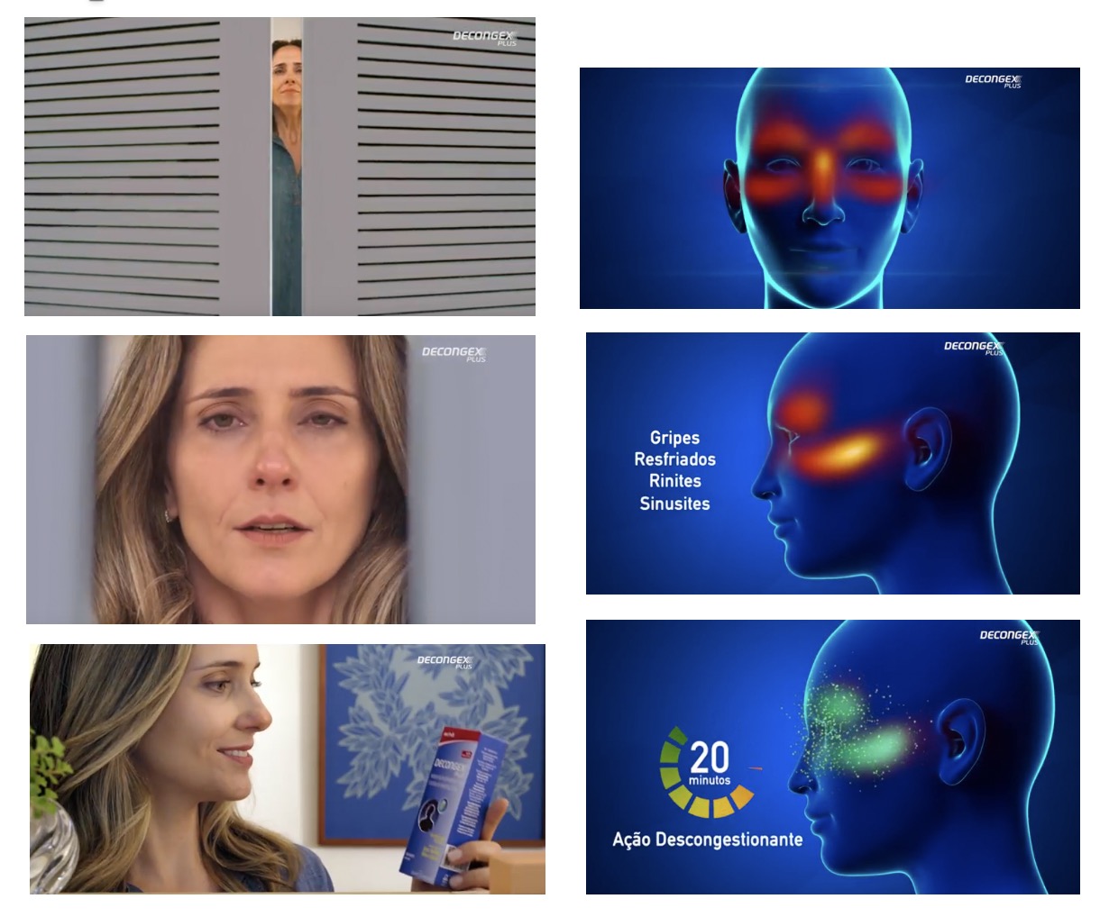
Mariane Cara (Brazil) provides a classic example [above] of this sort of thing: “From red (congested) to green (free to breathe, magically, in just 20 minutes,” she explains.

Sónia Marques (Portugal) provides another classic example: Note the juxtaposition of the suffering person with the cartoonish depiction of symptom relief. Not to mention the use of almost subliminal “scientific” imagery — the molecular diagrams, and menacing virus at top left.
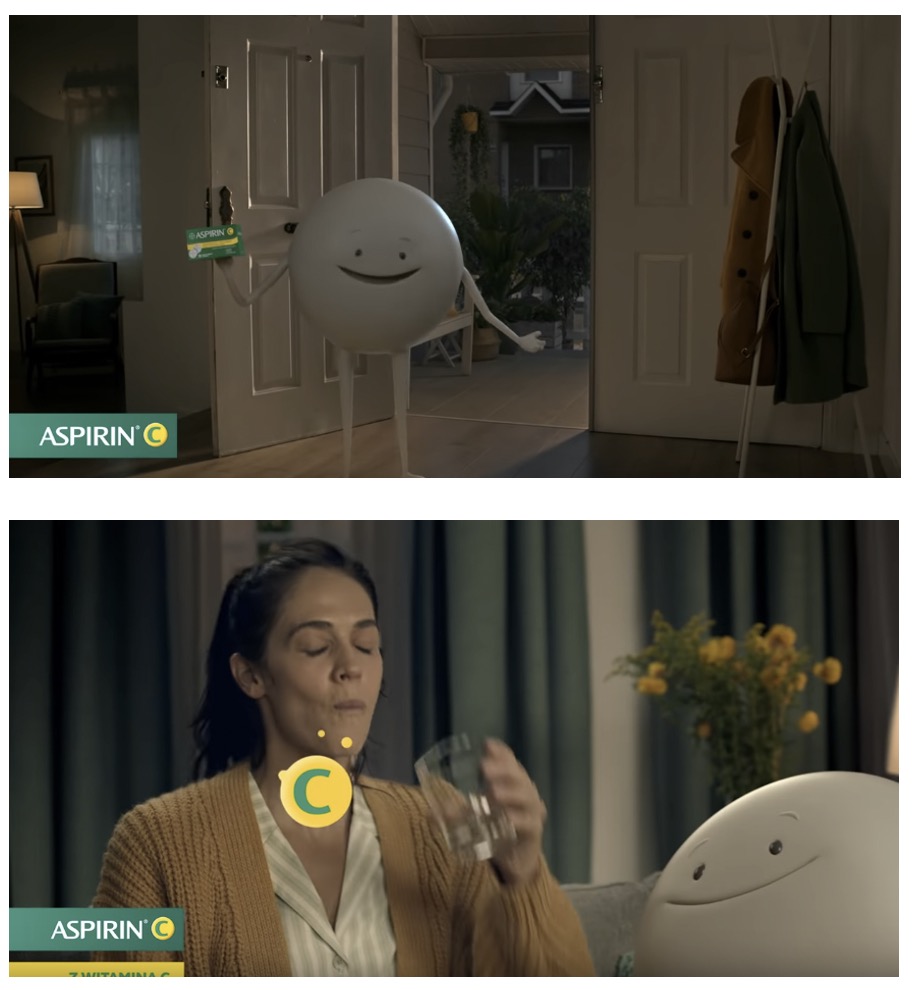
Maciej Biedziński (Poland) sends us the commercial above, which — he explains — “shows a happy, soft, round, cartoony capsule, looking like a creature from an animated movie for kids. It is caring, happy, gentle.”
Verbal cues of Misery Relief include:
- Fast-acting: e.g., “Sinus and nasal relief — so fast!”, “Defeat cold and flu symptoms fast”
- Immediate results: e.g., “Afrin works in seconds, pills can take up to 30 minutes”, “Powerful sinus relief, sip after sip”
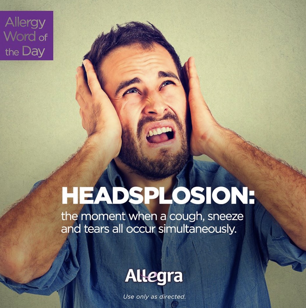
- Graphic description of symptoms and relief: “Headsplosion,” “The phlegm ejector”
In the Household Cleaning space, we find a version of Misery Relief coding. The “misery,” in these examples, is messiness.


Emergency Response
The Emergency Response source code’s norm (that is to say, its idea, value, higher-order benefit) can be described as follows: Medical help is on its way — like an ambulance with siren blaring.
Visual cues of the Emergency Response source code include:
- Red, orange, yellow — evocative of ambulances, fire engines, emergency rooms; (But note these colors can also connote lemon/orange/cherry flavors)
- Grid/network cues — also see Fast Forward — seem to symbolize a remedy that penetrates deeper, getting rapidly to the root of the problem
- Curving arrows indicate “long-lasting” but also perhaps rapid relief
The frequent use of scarlet and flame-red colors symbolize an emergency response; arrows, swooshes, and purposeful vectors suggest the same thing. All of which reminds us of the doctor and hospital, even as it reassures us that we needn’t go there — rapid relief is waiting for us at the pharmacy.
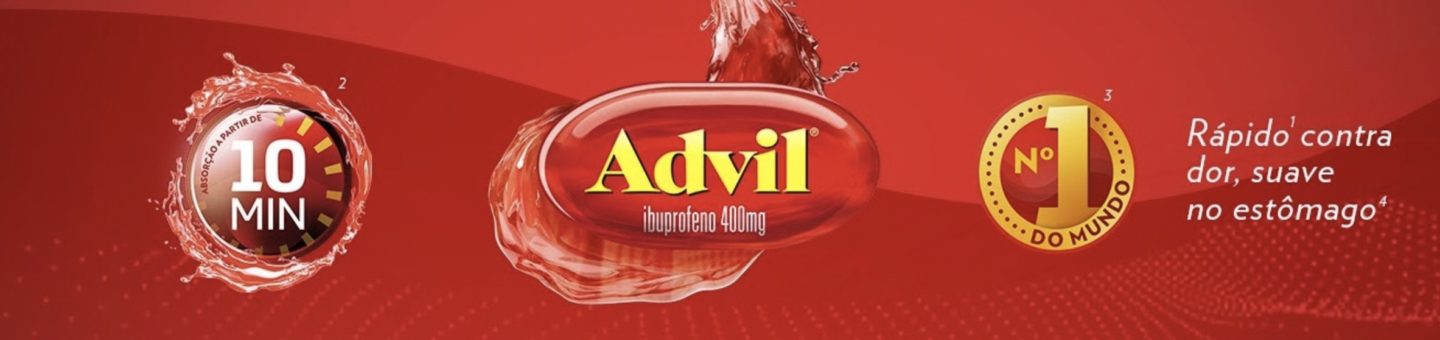
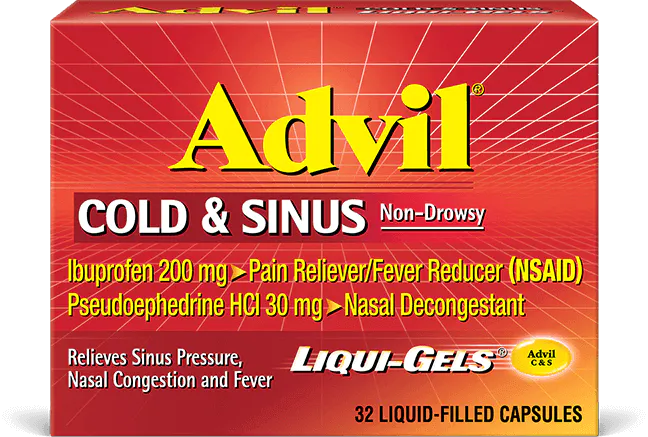
Mariane Cara (Brazil) writes that in Brazil, too, Advil uses “a forceful red color along with graphics that create a sense of ‘splash'” in order to communicate the idea of a fast-acting remedy,
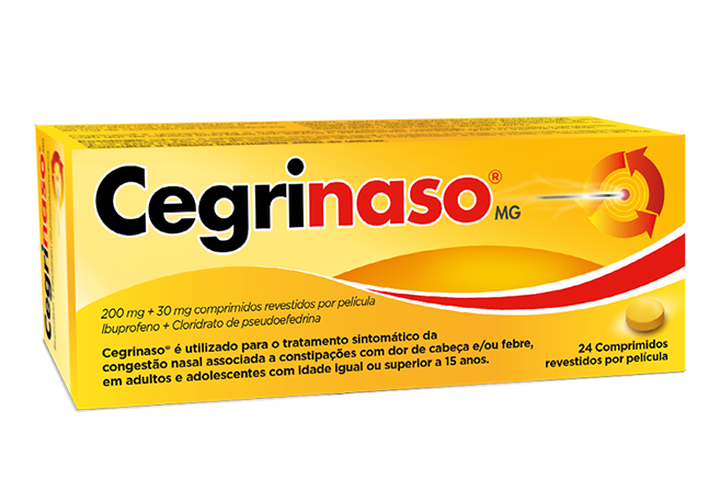
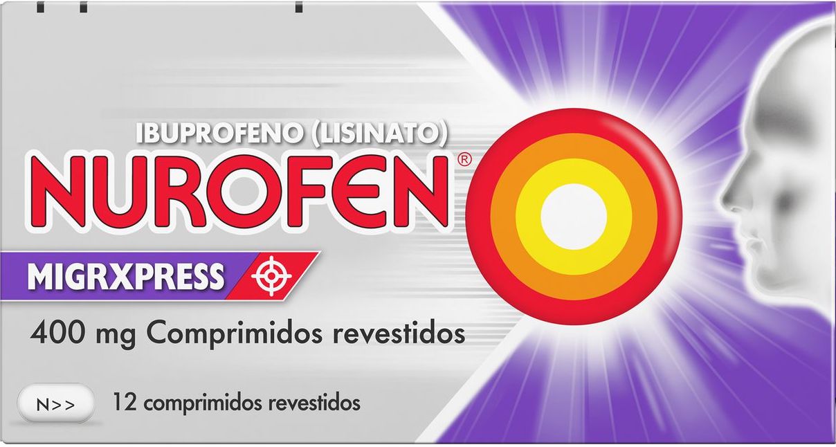
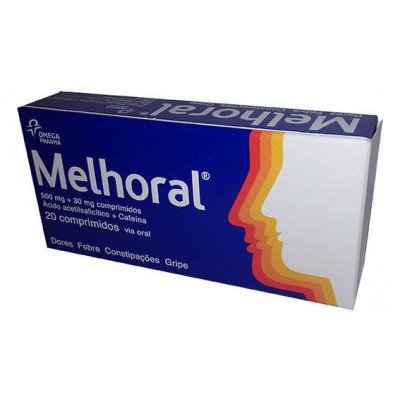
Sónia Marques (Portugal) provides several nice packaging examples [above].
Verbal cues of the Emergency Response source code include:
- Urgent: “Even a minute may seem too long”; “Houston, we have a problem”
- Fast, powerful: “Fast, powerful congestion relief ”; “tackle your worst cold and flu symptoms”; “Shortens your cold, works faster”
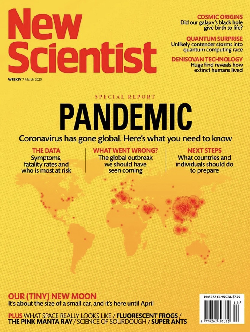
It has been interesting to see the colors orange and yellow frequently used, in the media, to illustrate the spread of Covid-19. For example:
Here’s the second series installment: FORCEFUL REMEDY.
Also see these global semio series: MAKING SENSE (Q&As) | SEMIOFEST SESSIONS (monthly mini-conferences) | COVID CODES | SEMIO OBJECTS | COLOR CODEX | DECODER (fictional semioticians) | CASE FILE | PHOTO OP | MEDIA DIET | TATTOO YOU (semioticians’ tattoos).