California Braille
One in a series — cross-posted from our sister publication, HILOBROW — dedicated to 25 of our favorite typefaces.
CALIFORNIA BRAILLE | c. 1980
Signage is generally designed to be seen, but tactile readers also require clear, legible typefaces. Since braille won the “War of the Dots” among competing tactile writing systems in the early 20th century, the printing of this important technology has become standardized. (Though braille, a six-dot, fixed-width writing system, was named for its inventor, the French blind activist Louis Braille, it has become a commonplace word and is not capitalized.) Although the details of tactile legibility are mostly lost on visual readers, typefaces read with the hands can be just as complicated as those read with the eyes.
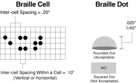
Signage in braille requires different standards than braille printed on paper. Some of the work of disability rights activists has been transmuted into law: the Americans with Disabilities Act of 1990 and subsequent revisions specified a range of requirements for size and spacing of braille signage in public places, writing into the law that people with visual impairments have a right to access wayfinding and directional signage. There are requirements for glare and contrast to accommodate readers with low vision. For tactile readers, signs must use Grade 2 braille, which contracts groups of letters (as opposed to grade 1 braille, which reproduces each letter of English and thus takes up more room and takes longer to read.) Many states have their own requirements for braille signage. “California braille,” in particular, is a stricter standard for braille signage written into the California Building Code in 1980, pre-ADA. It specifies spacing between dots in the same cell, spacing between dots in adjacent cells, dot sizes, and even requires that dots be “domed” rather than flat. California Braille spacing is at the maximum edges of ADA requirements for width, but still readable with a finger. It has been widely adopted across the country and is probably on the bathroom sign at your office building.