Akzidenz-Grotesk
One in a series — cross-posted from our sister publication, HILOBROW — dedicated to 25 of our favorite typefaces.
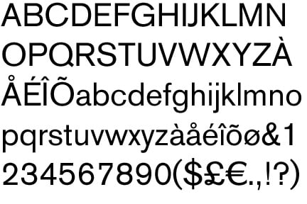
AKZIDENZ-GROTESK | THEINHARDT TYPE FOUNDRY | 1896
The next time some expertly coiffed jerk starts raving about Helvetica Neue, or talking about how they’ve just bought some silkscreen posters featuring typographic representations of ’80s movies in Folio, you can slap them across the face and tell them about Akzidenz-Grotesk, the granddaddy of all those sharp sans serif typefaces that seem to rule our internets these days.
In 18th- and 19th-century Germany — the birthplace, in 1450, of the Western printing press — a robust type and printing industry invented most of what we know about type and how we use it today. The reputation of each type house, or foundry, was based on the unique typefaces it developed… like a gang’s graffiti tags, only fancier. Akzidenz-Grotesk was created by the Theinhardt Schriftgiesserei, one of the Prussian Academy of Sciences foundries, then made popular in the early 20th century by Berlin’s Berthold Type Foundry. In a time where the actual possession of the blocks that make up the type was an essential part of owning a typeface, Berthold made a habit of buying, or just taking over, the typeface creations of smaller foundries which had succumbed to financial or political misfortune. In 1918, with the fall of the Prussian monarchy, Hermann Berthold made Akzidenz-Grotesk his own.
At that time, when the playful, witty Rococo style was still considered the height of sophistication, most successful typefaces boasted aristocratic little flourishes. So Akzidenz-Grotesk, a stark, proto-Brutalist typeface totally out of step with the times, was a revelation. It was rediscovered in the 1950s — along with early 20th century grotesque typefaces, like Franklin Gothic and Monotype Grotesque — by the type designers who gave us that era’s neo-grotesque faces like Univers, and yes, the ubiquitous Helvetica.
I’m a type geek so I enjoy knowing about the origin of Akzidenz-Grotesk… but the most important thing to know about it is what a beautiful bit of design it is. It’s remained popular and influential for a century now because it is regal without being pretentious, clean without being soulless. Its nearly circular bowls, the high join on its “K,” the squared dot on its lowercase “i,” even the sharp intensity of its exclamation point, all add up to something remarkable… and remarkably poised. Akzidenz-Grotesk is the typographical equivalent of that amazing friend of yours who can make cogent, compelling arguments without ever getting heated or cruel. Typefaces come and go: Akzidenz-Grotesk remains.