Todd Klone
One in a series — cross-posted from our sister publication, HILOBROW — dedicated to 25 of our favorite typefaces.
TODD KLONE | TODD KLEIN | 1995
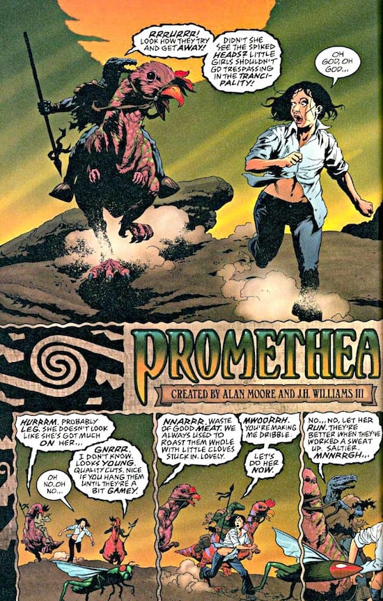
In 1993, the annual Will Eisner Comic Industry Awards established a “best lettering” category. Todd Klein won it that year, and has gone on to win it fifteen more times. You’ve seen Klein’s squarish, slyly weighted, effortlessly legible capital letters if you’ve read any of the Neil Gaiman-written Sandman series, or The Invisibles, or Promethea, or any of several thousand comics published since he lettered Firestorm #1 in 1977: the curve of the “D” skating along the top before it veers back to the base, the left stroke of the “A” slightly curved and the right one straight, the beams of the “E” at a slight slope, a friendly descender appended to the “U.” Klein’s default style is one of the classic American comics letterform sets, as much a model of its kind as Ben Oda’s or Tom Orzechowski’s. He’s also impressively versatile: Sandman required Klein to devise separate lettering styles for each of its seven central characters, as well as many others, and he has a knack for coming up with Roman character sets that suggest visually that they’re being spoken in Russian, or by an undersea creature, or by the embodiment of Delirium.
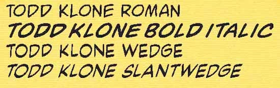
Around the time of Klein’s first Eisner victory, though, computer lettering started to replace hand lettering in American comics; it’s much faster and easier to adjust, although it rarely integrates with hand-drawn artwork as beautifully as pen-and-ink lettering could. Almost all mainstream comics are now lettered on computers, often from a small handful of relatively characterless fonts. (Some of them are more or less knockoffs of Klein’s style.) Most of the old-school comics letterers who’ve weathered the change now work with typefaces made from their handwriting. Klein started making his own fonts in the mid-’90s, and has largely been lettering comics with them on computers since then. “Todd Klone” is the name of his main Roman font (you can see a sample of it, along with a few of its variants, here). It’s not for sale, either: “I feel that these fonts are an extension of my personal style, and I want to keep them for my own use for the foreseeable future,” Klein writes. Todd Klone doesn’t quite have the eye-pleasing micro-variations of Klein’s hand lettering, but it’s clear and luxurious, the comics-page equivalent of narration by Morgan Freeman.